ETC3250/5250 Introduction to Machine Learning
Week 2: Visualising your data and models
Model-in-the-data-space
We plot the model on the data to assess whether it fits or is a misfit!
Doing this in high-dimensions is considered difficult!
So it is common to only plot the data-in-the-model-space.
Data-in-the-model-space
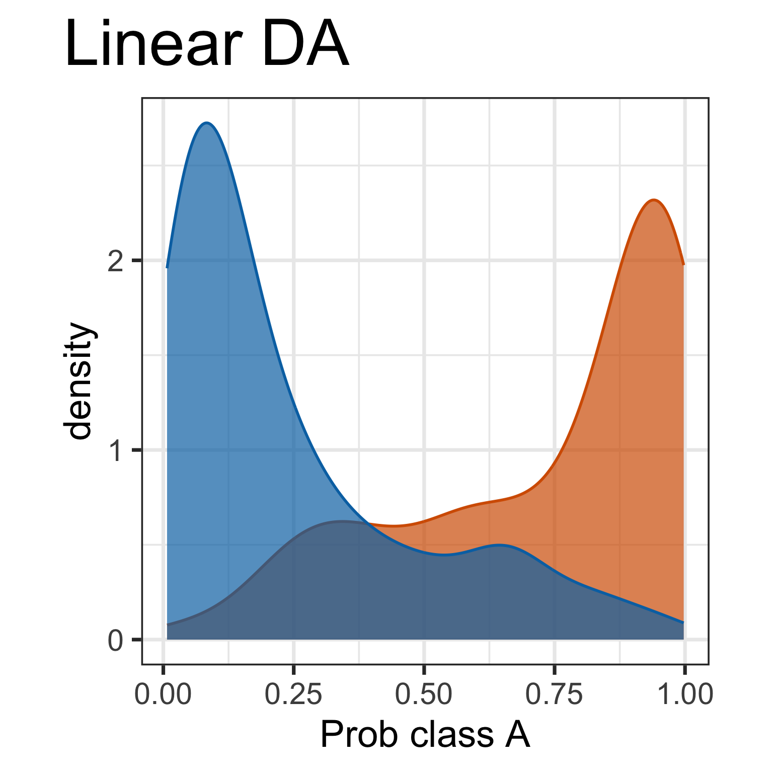
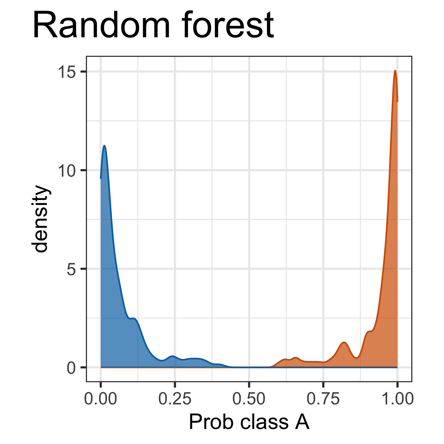
Predictive probabilities are aspects of the model. It is useful to plot. What do we learn here?
But it doesn’t tell you why there is a difference.
Model-in-the-data-space
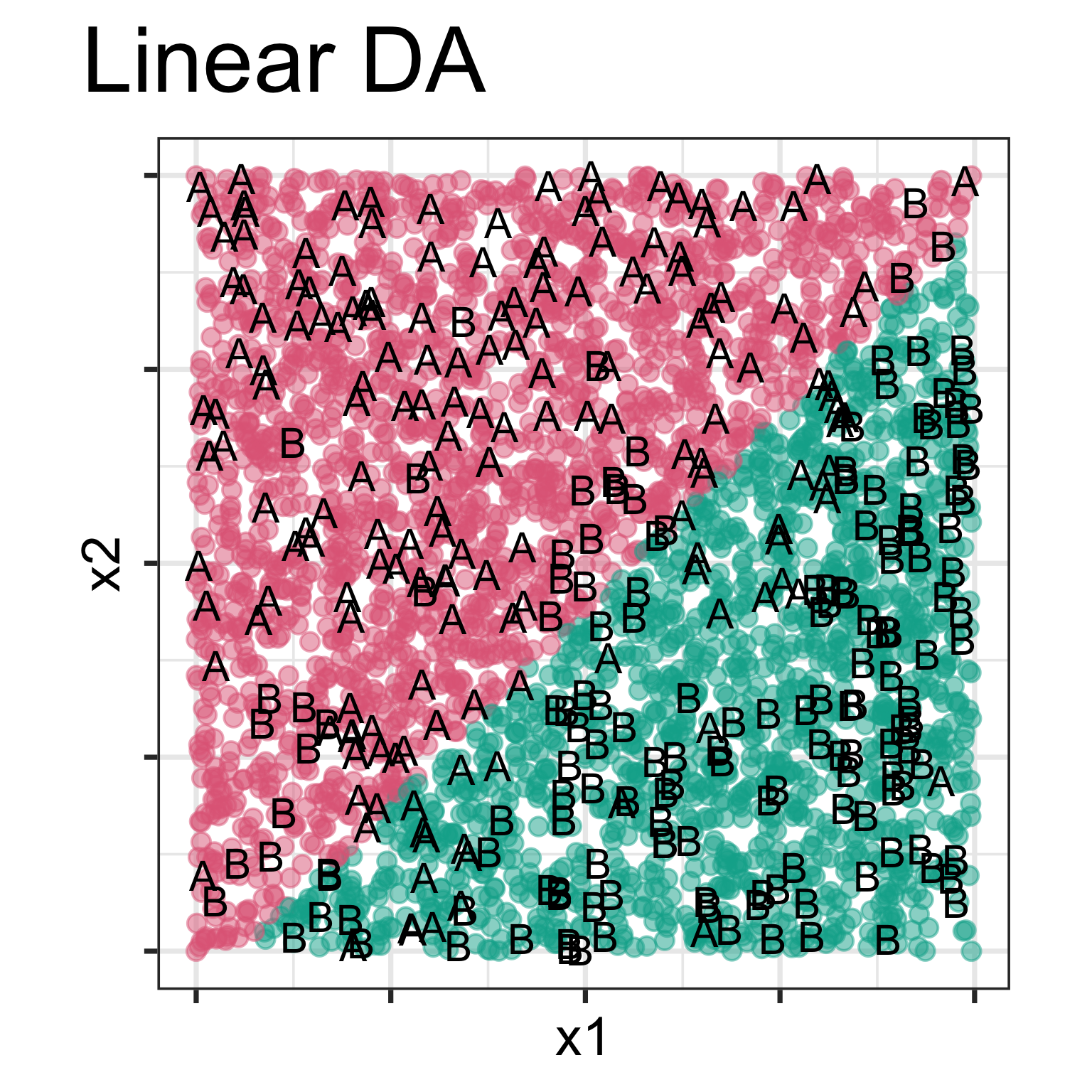
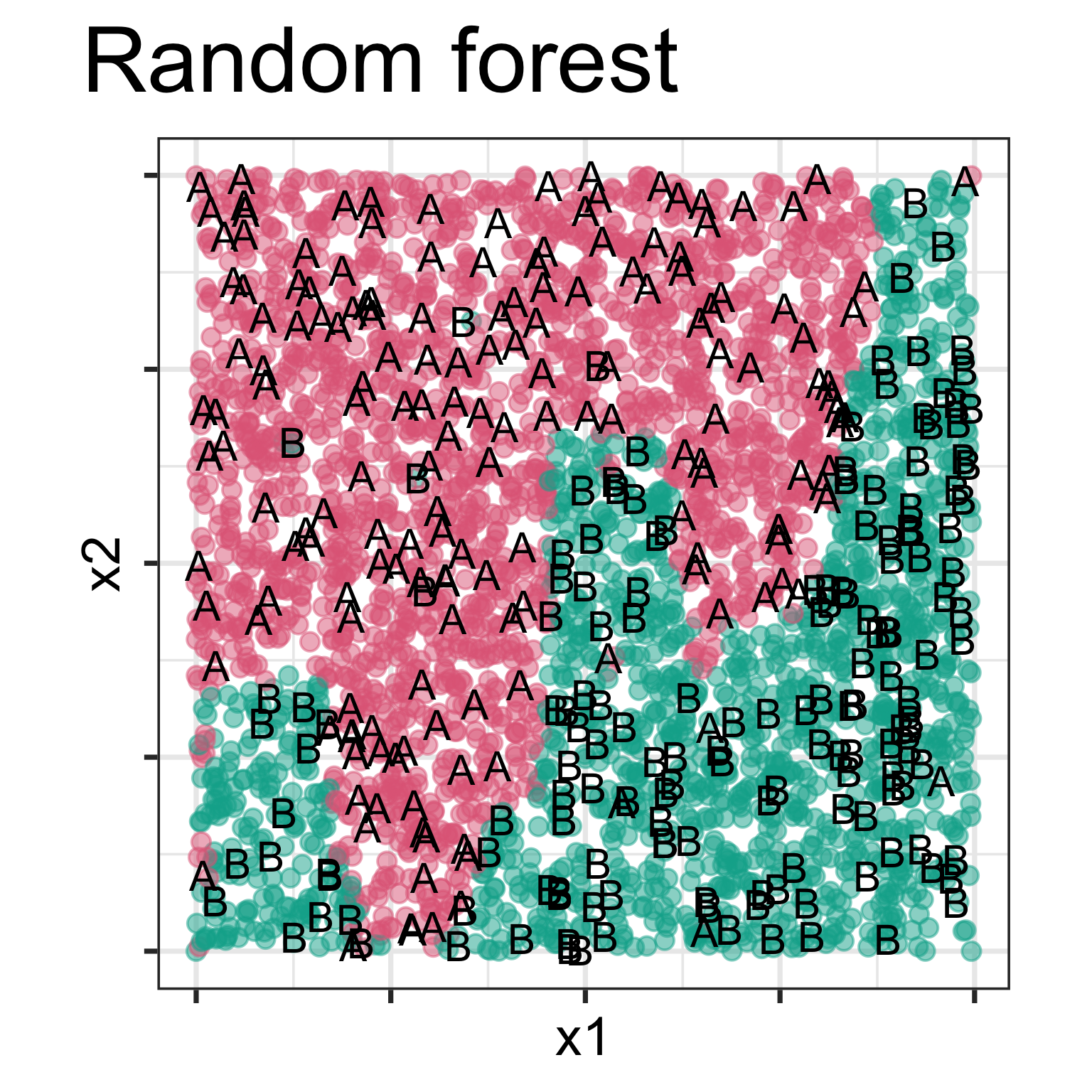
Model is displayed, as a grid of predicted points in the original variable space. Data is overlaid, using text labels. What do you learn?
One model has a linear boundary, and the other has the highly non-linear boundary, which matches the class cluster better. Also …
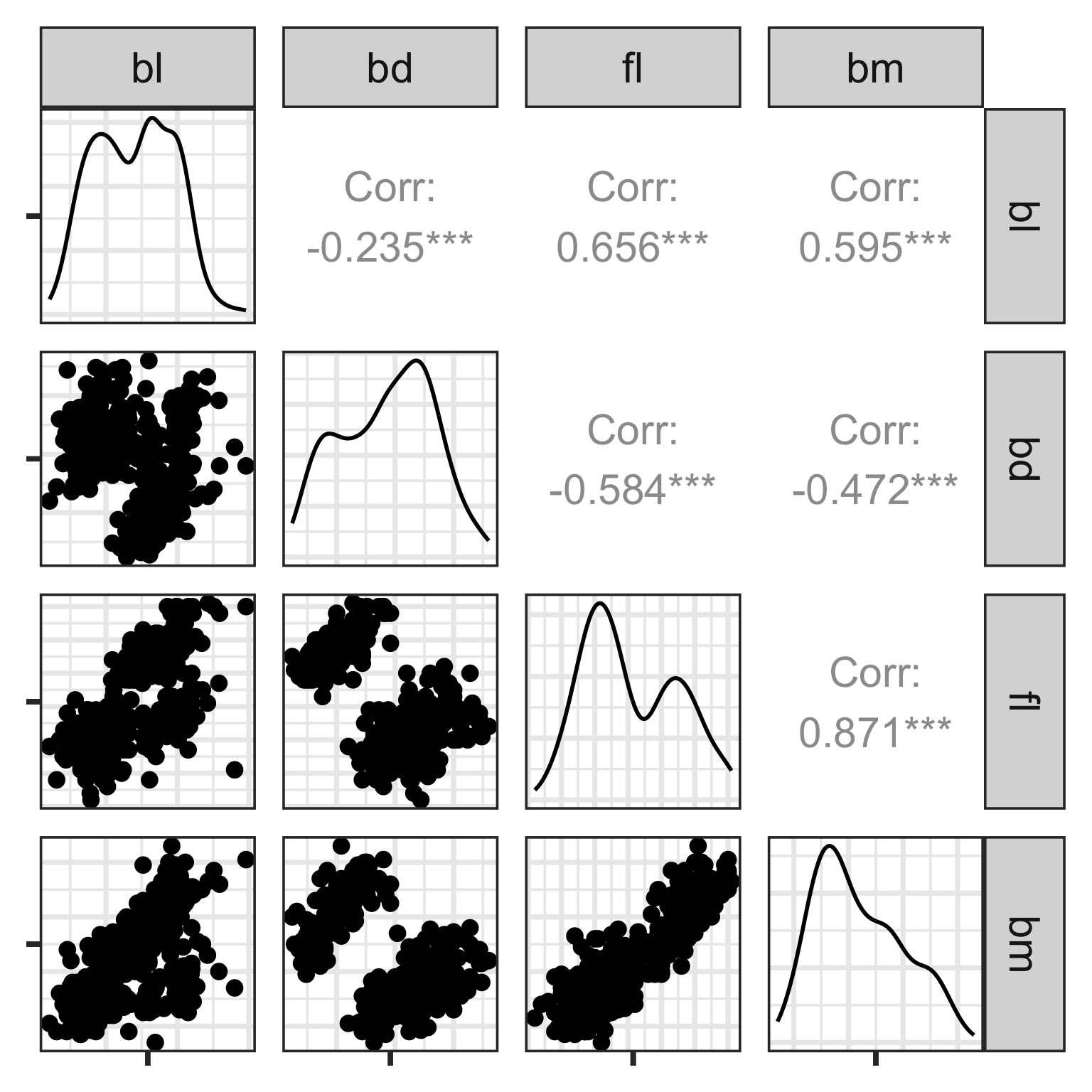
Scatterplot matrix
Start simply! Make static plots that organise the variables on a page.
Plot all the pairs of variables. When laid out in a matrix format this is called a scatterplot matrix.
Here, we see linear association, clumping and clustering, potentially some outliers.
Scatterplot matrix: drawbacks
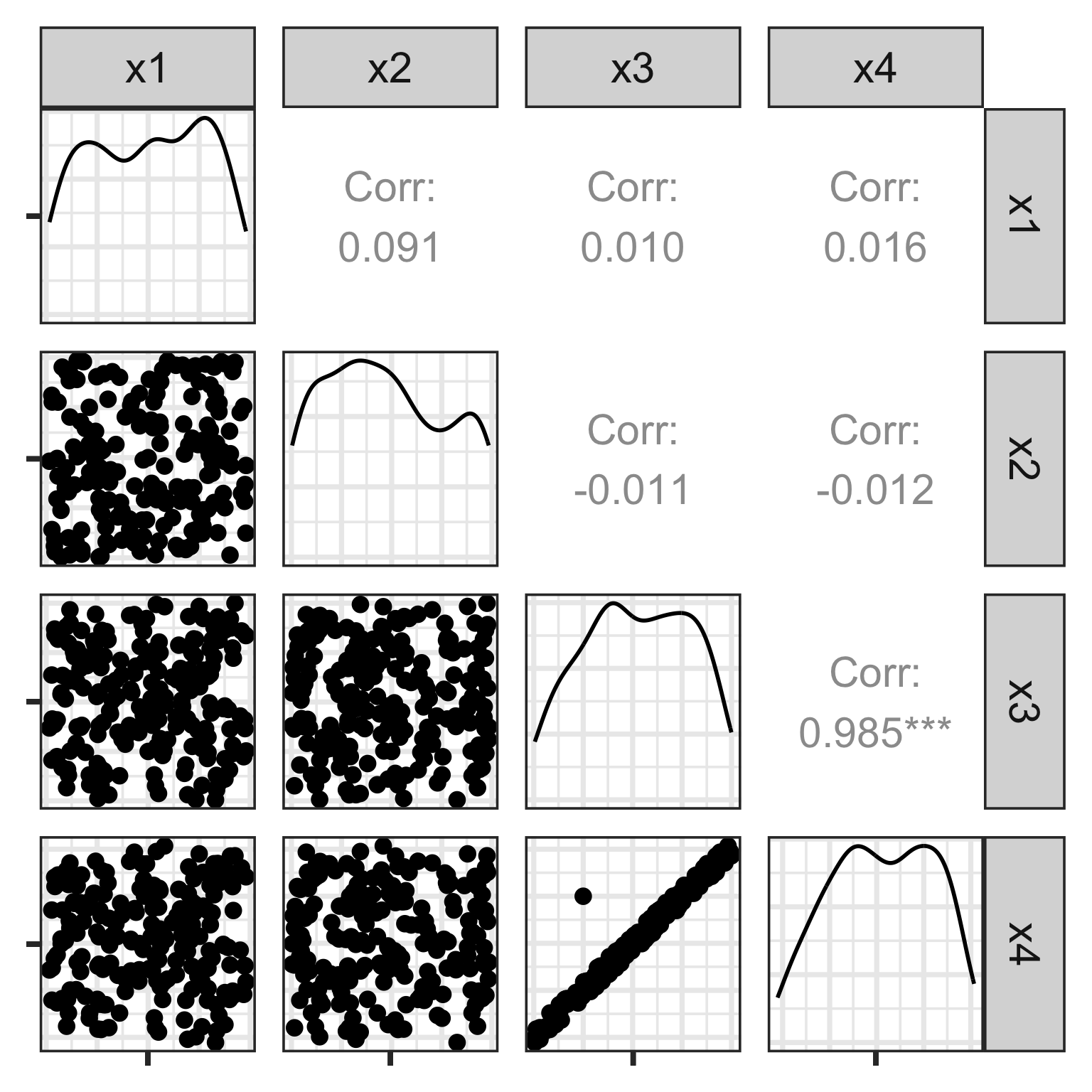
There is an outlier in the data on the right, like the one in the left, but it is hidden in a combination of variables. It’s not visible in any pair of variables.
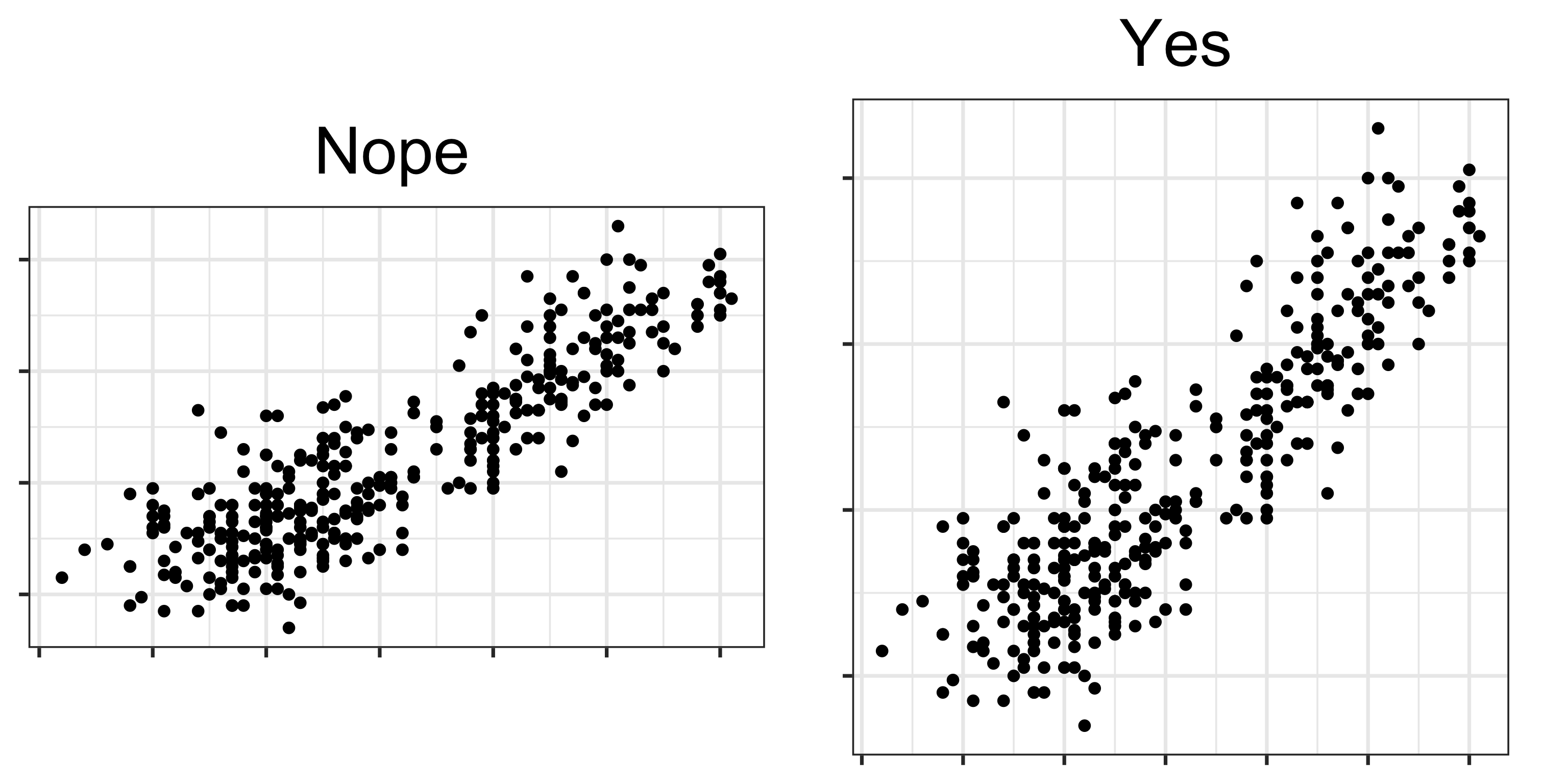
Perception
Aspect ratio for scatterplots needs to be equal, or square!
When you make a scatterplot of two variables from a multivariate data set, most software renders it with an unequal aspect ratio, as a rectangle. You need to over-ride this and force the square aspect ratio. Why?
Because it adversely affects the perception of correlation and association between variables.
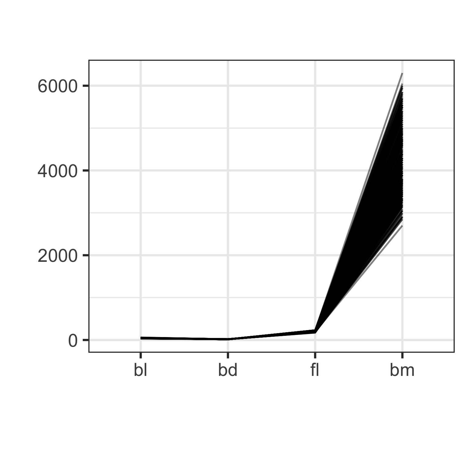
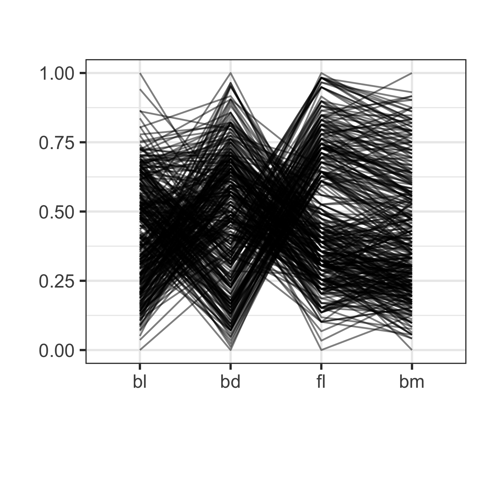
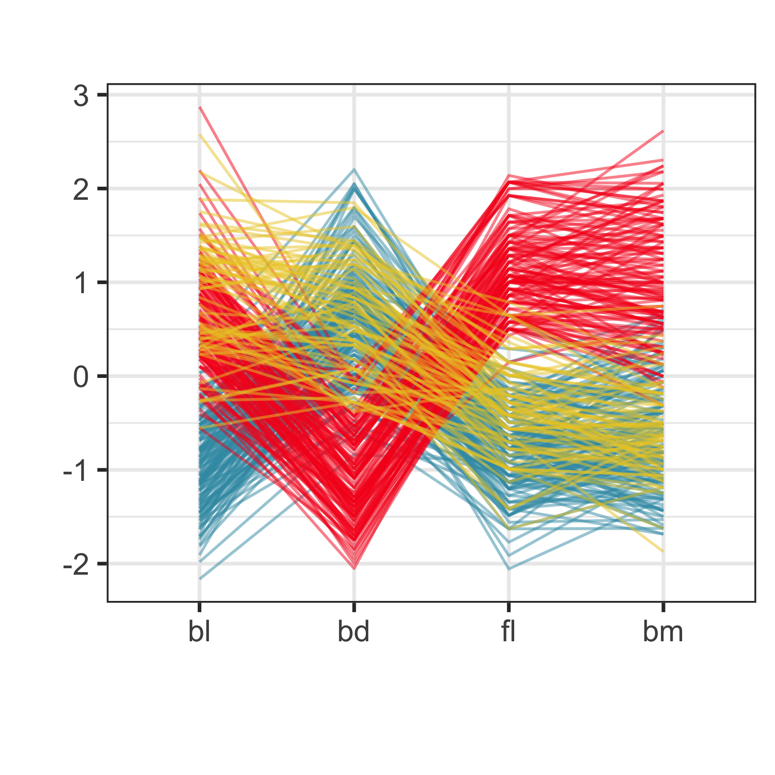
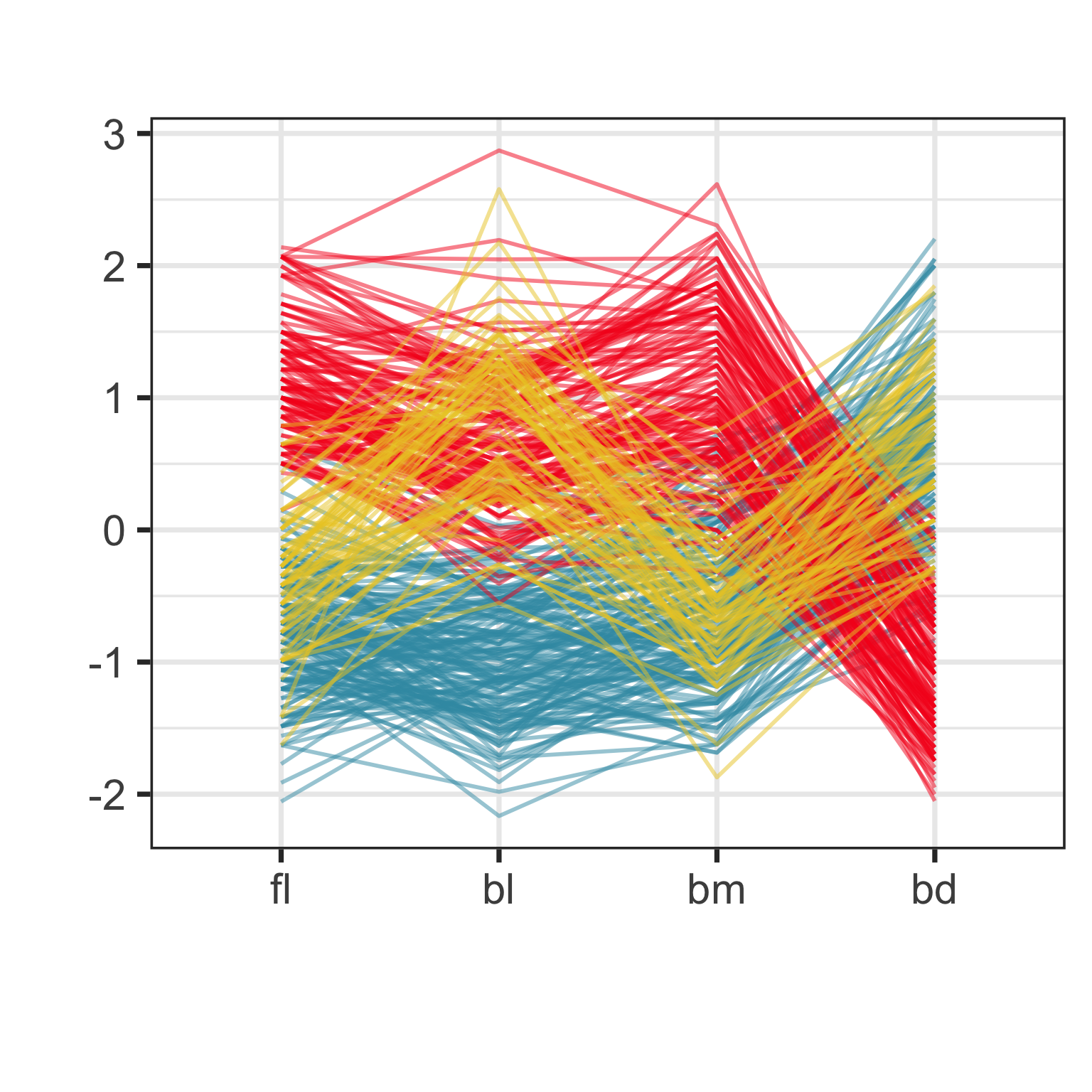
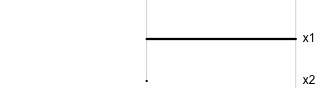
Parallel coordinate plot
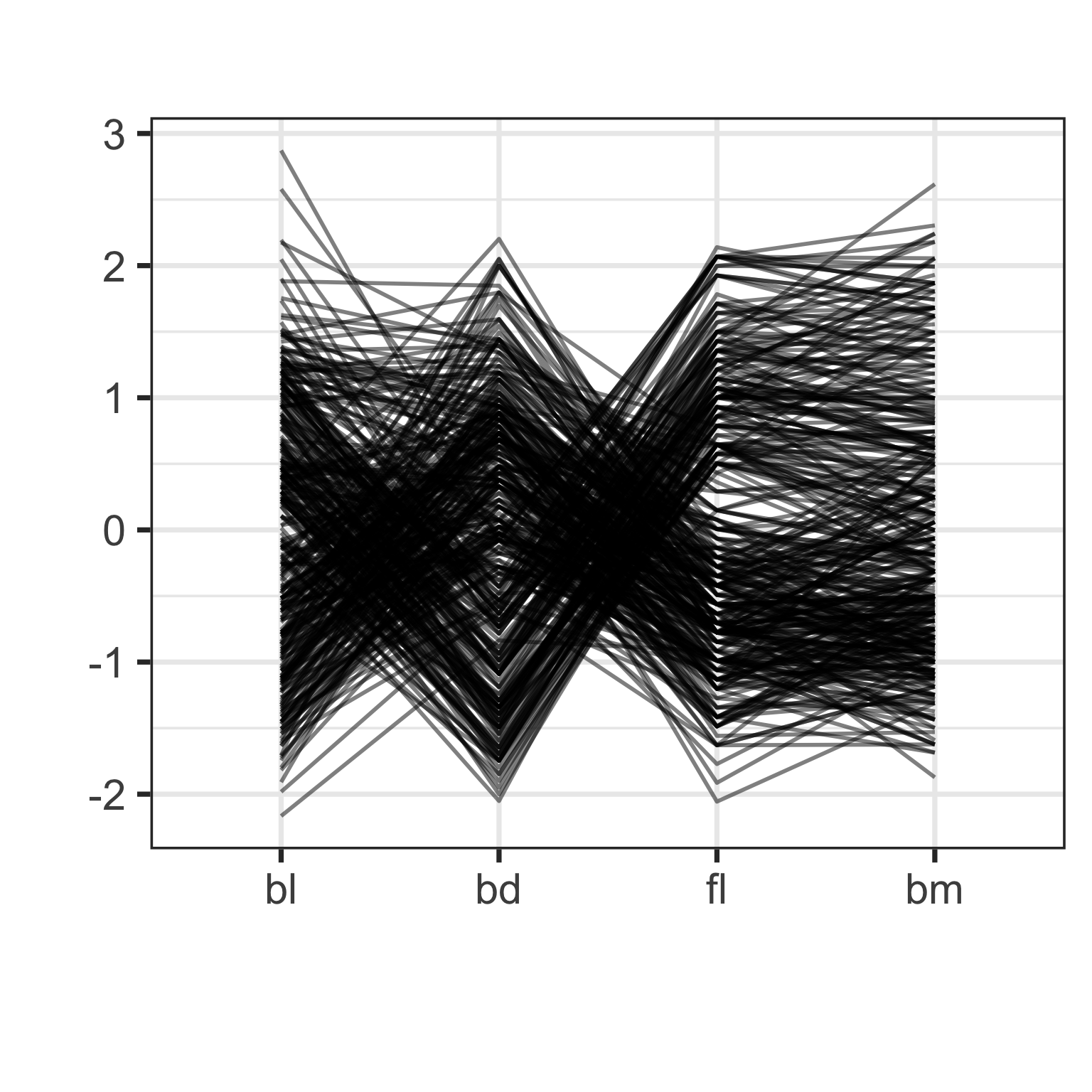
Parallel coordinate plots are side-by-side dotplots with values from a row connected with a line.
Examine the direction and orientation of lines to perceive multivariate relationships.
Crossing lines indicate negative association. Lines with same slope indicate positive association. Outliers have a different up/down pattern to other points. Groups of lines with same pattern indicate clustering.
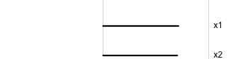
Parallel coordinate plot: effect of scaling
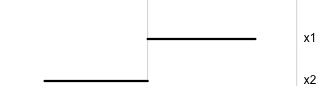
Parallel coordinate plot: effect of ordering
High-dimensions in statistics
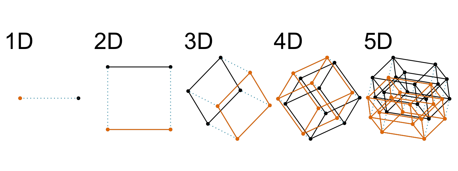
Increasing dimension adds an additional orthogonal axis.
If you want more high-dimensional shapes there is an R package, geozoo, which will generate cubes, spheres, simplices, mobius strips, torii, boy surface, klein bottles, cones, various polytopes, …
And read or watch Flatland: A Romance of Many Dimensions (1884) Edwin Abbott.
Tours of linear projections
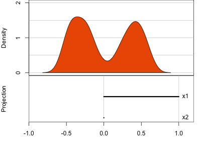
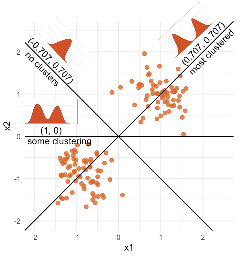
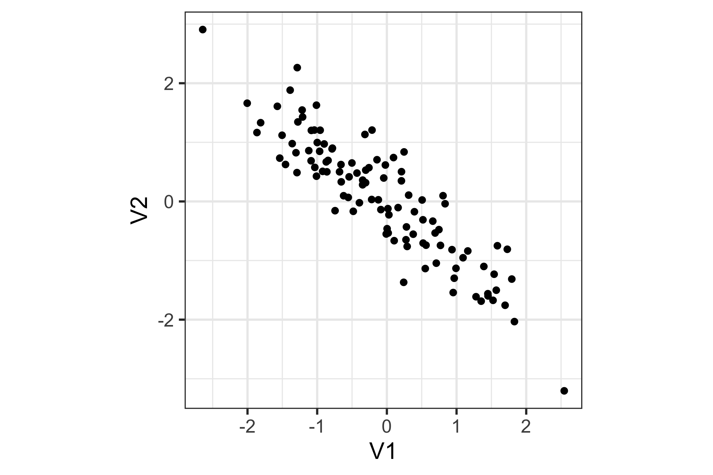
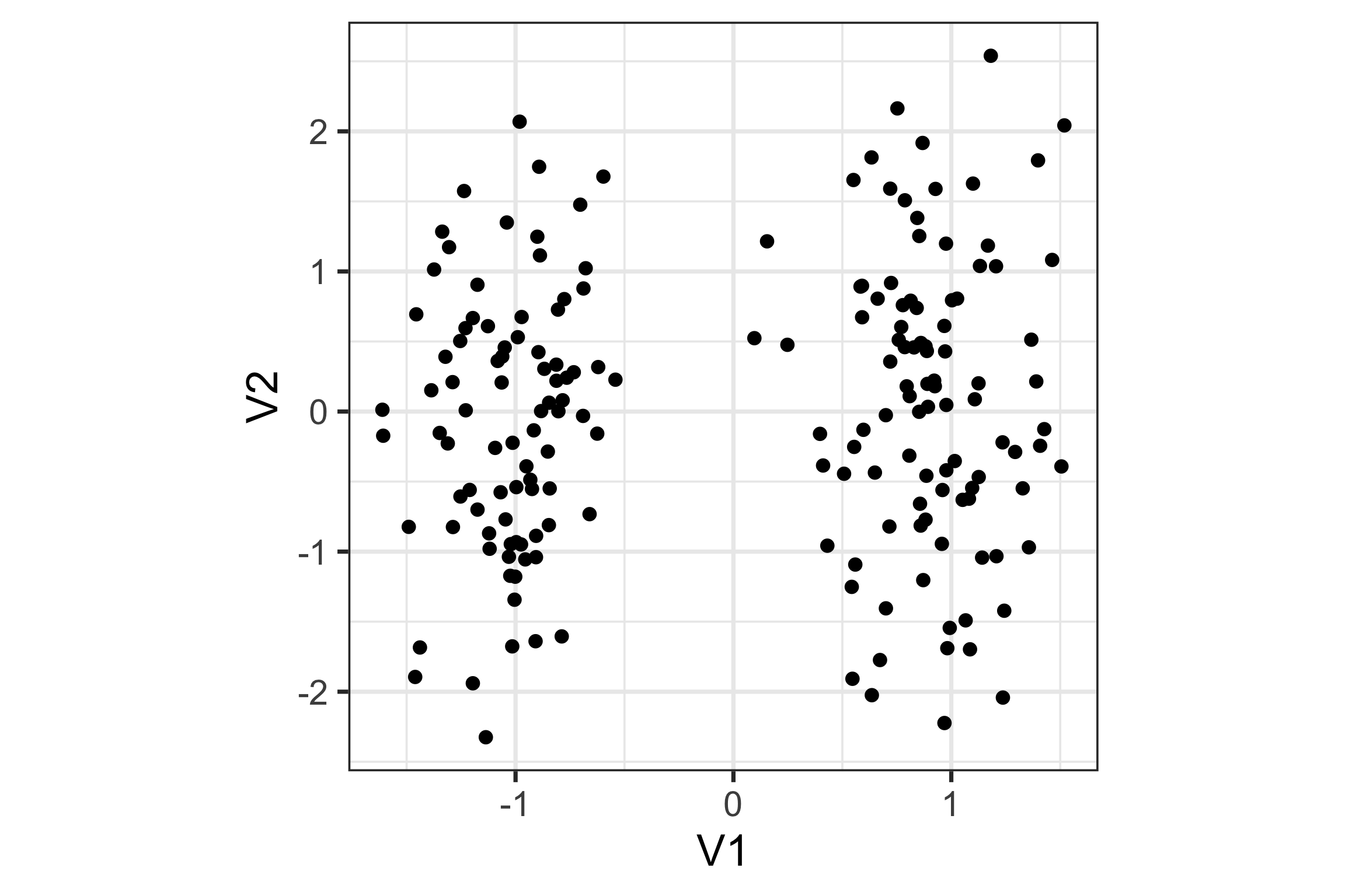
Data is 2D: \(~~p=2\)
Projection is 1D: \(~~d=1\)\[\begin{eqnarray*} A_{~2\times 1} = \left[ \begin{array}{c} a_{~11} \\ a_{~21}\\ \end{array} \right]_{~2\times 1} \end{eqnarray*}\]
Notice that the values of \(A\) change between (-1, 1). All possible values being shown during the tour.
\[\begin{eqnarray*} A = \left[ \begin{array}{c} 1 \\ 0\\ \end{array} \right] ~~~~~~~~~~~~~~~~ A = \left[ \begin{array}{c} 0.7 \\ 0.7\\ \end{array} \right] ~~~~~~~~~~~~~~~~ A = \left[ \begin{array}{c} 0.7 \\ -0.7\\ \end{array} \right] \end{eqnarray*}\]
watching the 1D shadows we can see:
- unimodality
- bimodality, there are two clusters.
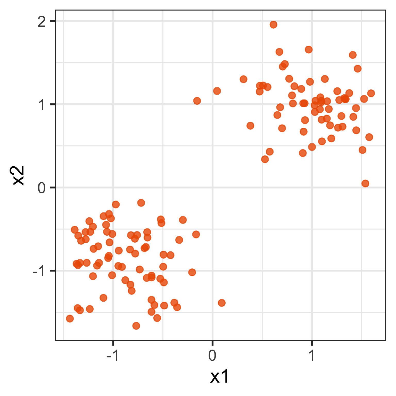
What does the 2D data look like? Can you sketch it?
Tours of linear projections
⟵
The 2D data
Tours of linear projections
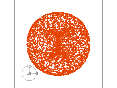
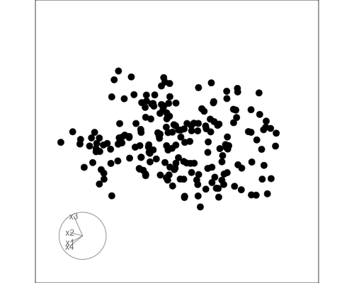
Data is 3D: \(p=3\)
Projection is 2D: \(d=2\)
\[\begin{eqnarray*} A_{~3\times 2} = \left[ \begin{array}{cc} a_{~11} & a_{~12} \\ a_{~21} & a_{~22}\\ a_{~31} & a_{~32}\\ \end{array} \right]_{~3\times 2} \end{eqnarray*}\]
Notice that the values of \(A\) change between (-1, 1). All possible values being shown during the tour.
See:
- circular shapes
- some transparency, reveals middle
- hole in in some projections
- no clustering
Tours of linear projections
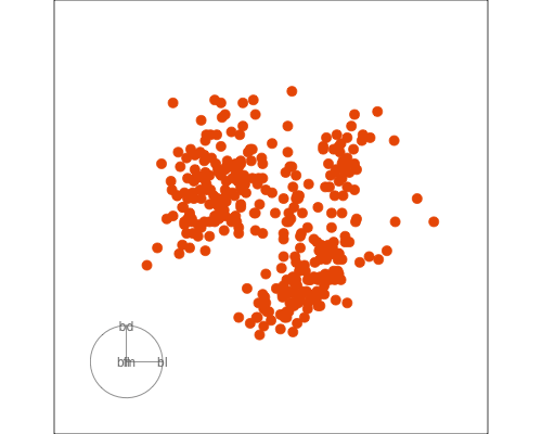
Data is 4D: \(p=4\)
Projection is 2D: \(d=2\)
\[\begin{eqnarray*} A_{~4\times 2} = \left[ \begin{array}{cc} a_{~11} & a_{~12} \\ a_{~21} & a_{~22}\\ a_{~31} & a_{~32}\\ a_{~41} & a_{~42}\\ \end{array} \right]_{~4\times 2} \end{eqnarray*}\]
How many clusters do you see?
- three, right?
- one separated, and two very close,
- and they each have an elliptical shape.
- do you also see an outlier or two?
Intuitively, tours are like …
And help to see the data/model as a whole
Avoid misinterpretation …

… see the bigger picture!
Image: Sketchplanations.
How to save a tour
PCA
For this 2D data, sketch a line or a direction that if you squashed the data into it would provide most of the information.
What about this data?
Example
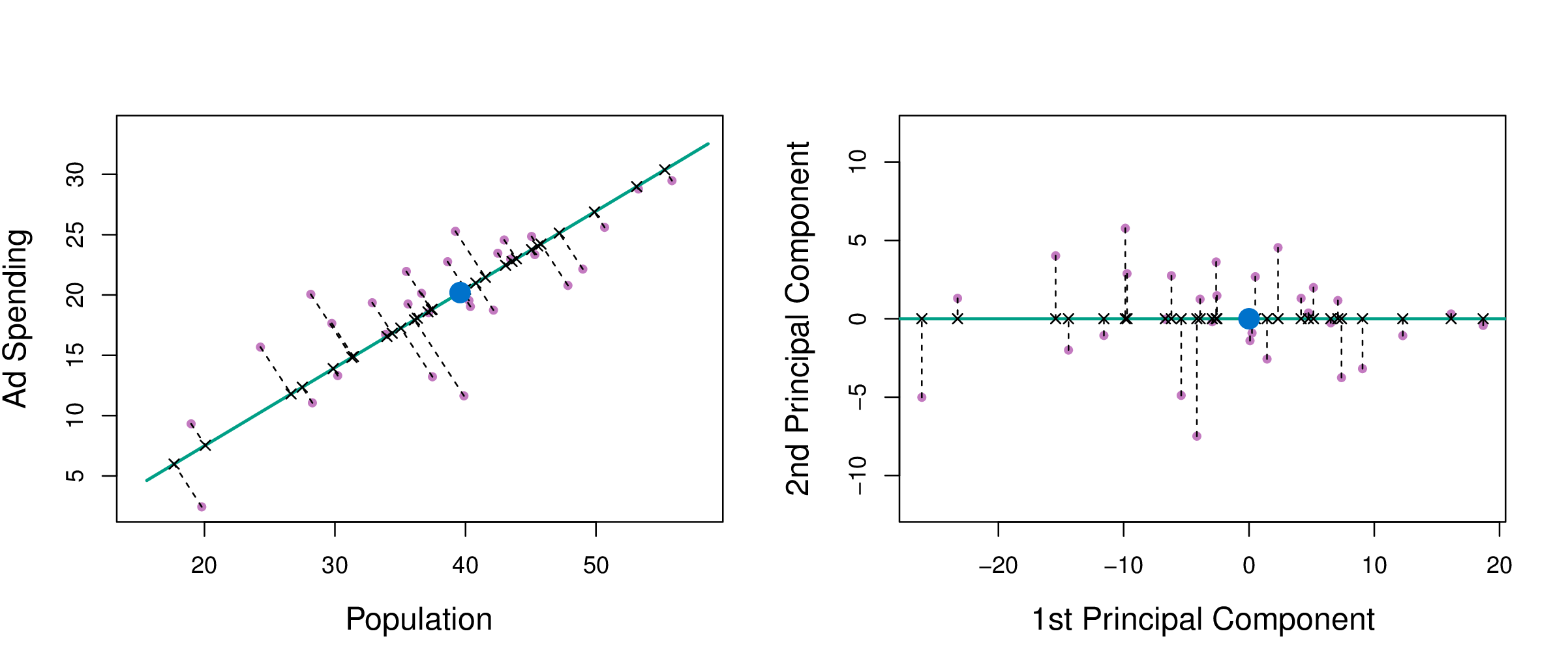
If you think of the first few PCs like a linear model fit, and the others as the error, it is like regression, except that errors are orthogonal to model.
(Chapter6/6.15.pdf)
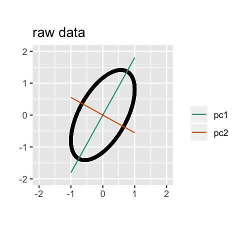
Geometry
PCA can be thought of as fitting an \(n\)-dimensional ellipsoid to the data, where each axis of the ellipsoid represents a principal component. The new variables produced by principal components correspond to rotating and scaling the ellipse into a circle. It spheres the data.
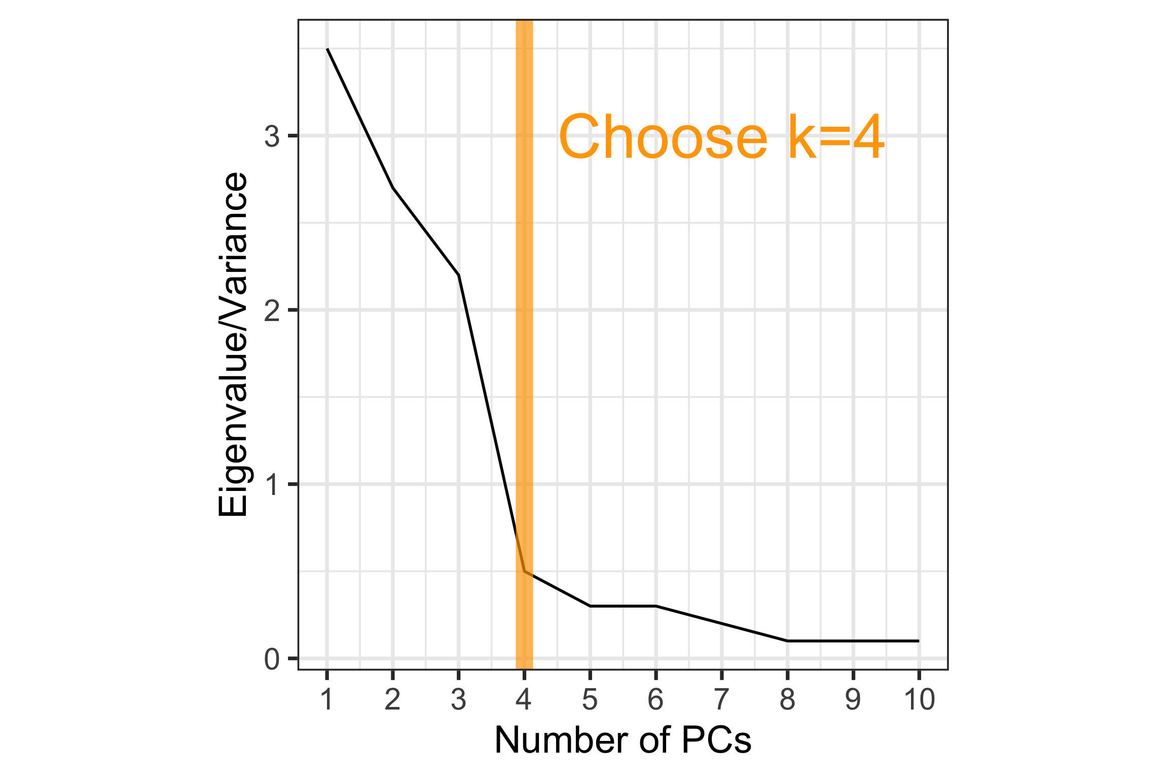
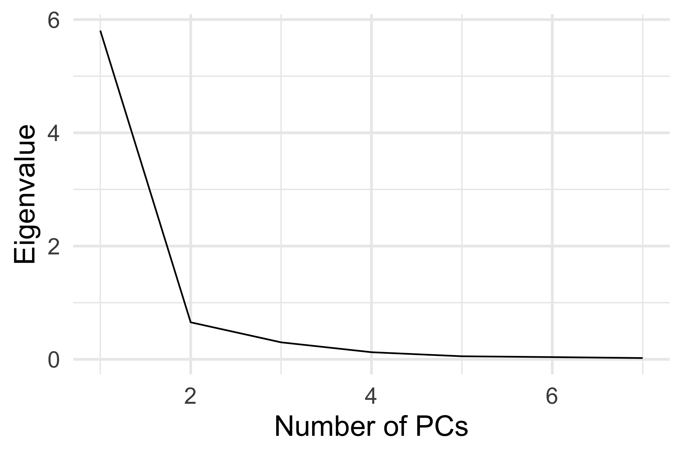
How to choose \(k\)?
Scree plot: Plot of variance explained by each component vs number of component.
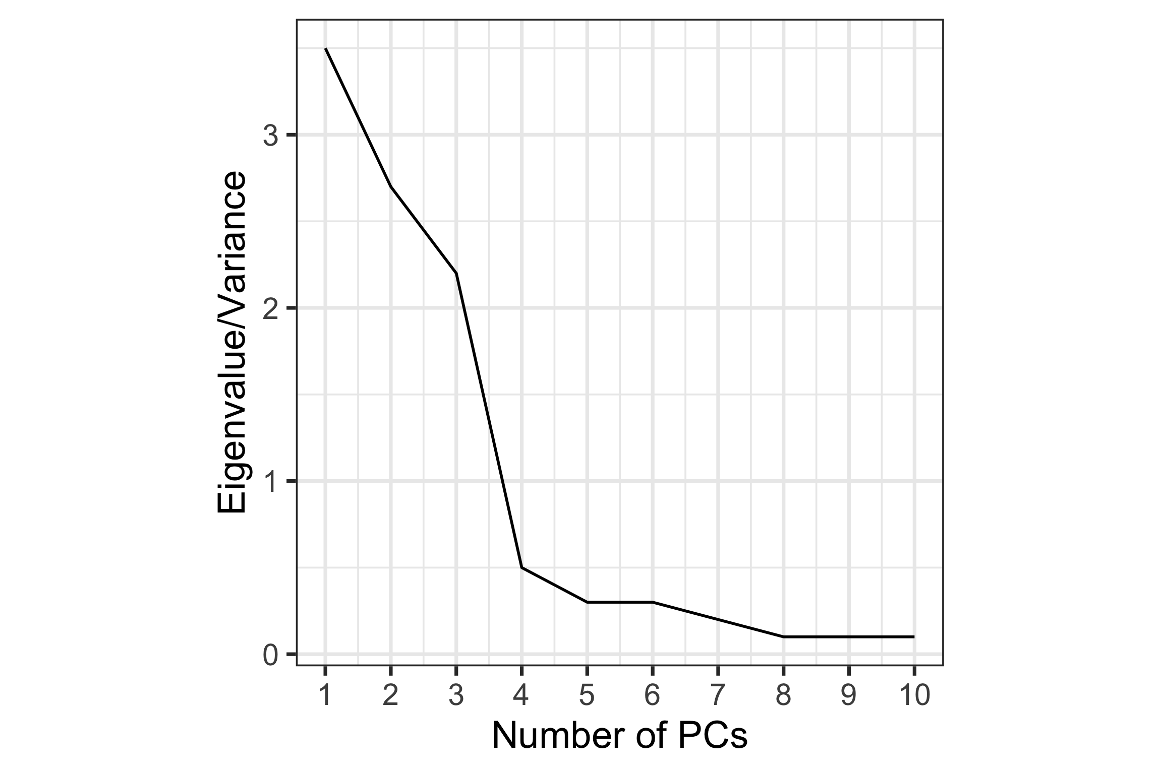
How to choose \(k\)?
Scree plot: Plot of variance explained by each component vs number of component.
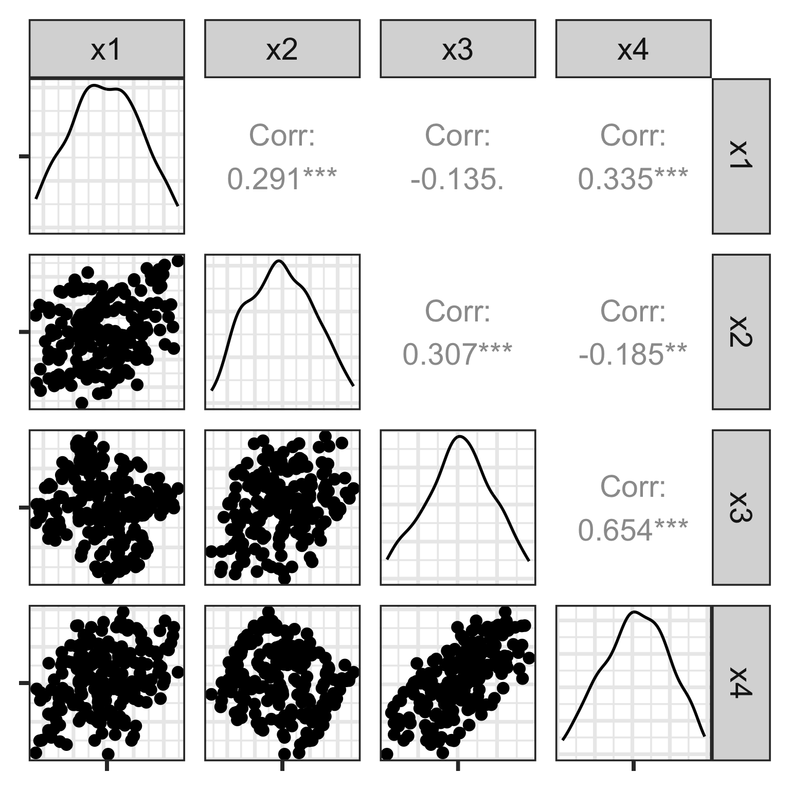
Explore the data: scatterplot matrix
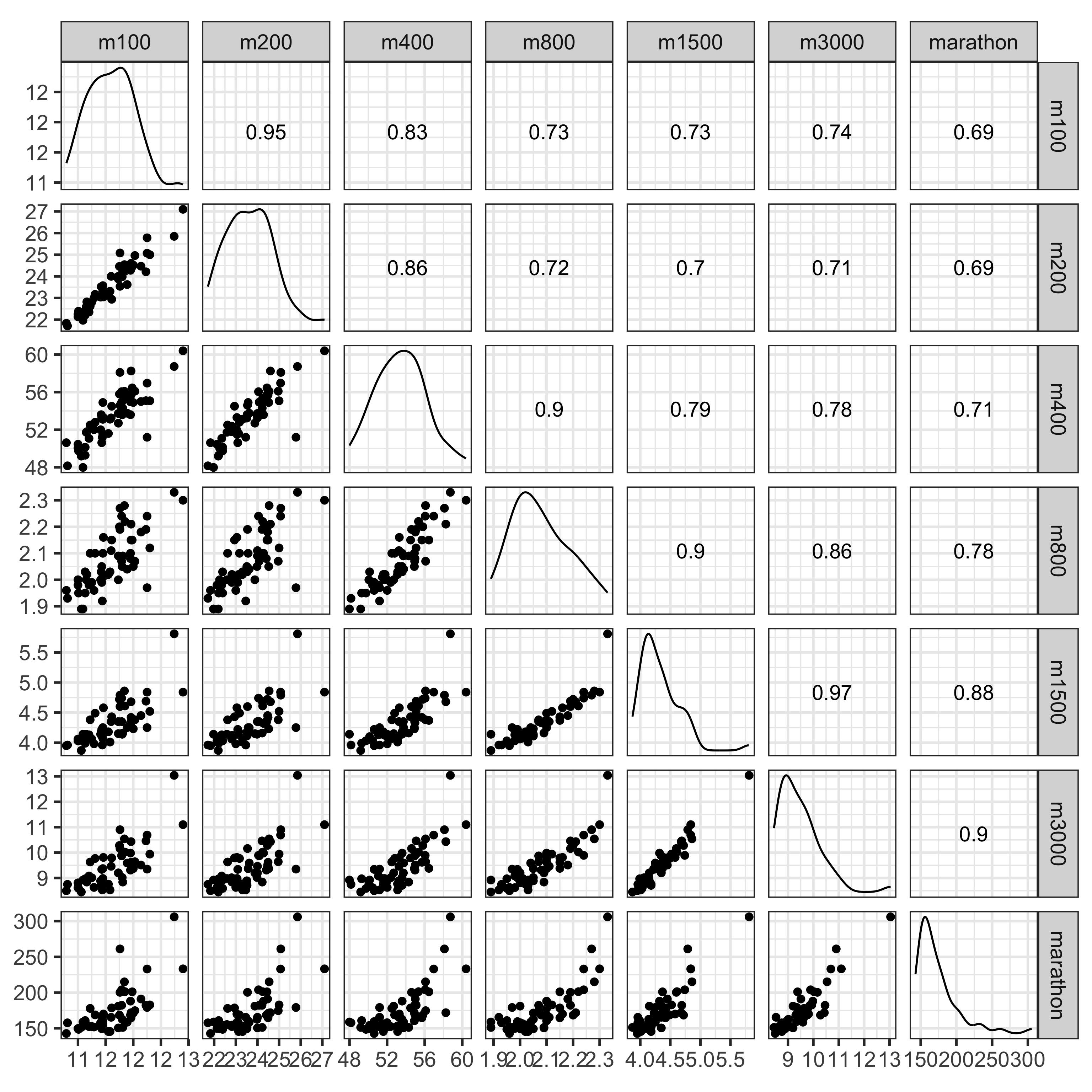
What do you learn?
- Linear relationships between most variables
- Outliers in long distance events, and in 400m vs 100m, 200m
- Non-linear relationship between marathon and 400m, 800m
Explore the data: tour
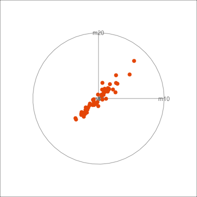
What do you learn?
- Mostly like a very slightly curved pencil
- Several outliers, in different directions
Decide
Scree plot: Where is the elbow?
At \(k=2\), thus the scree plot suggests 2 PCs would be sufficient to explain the variability.
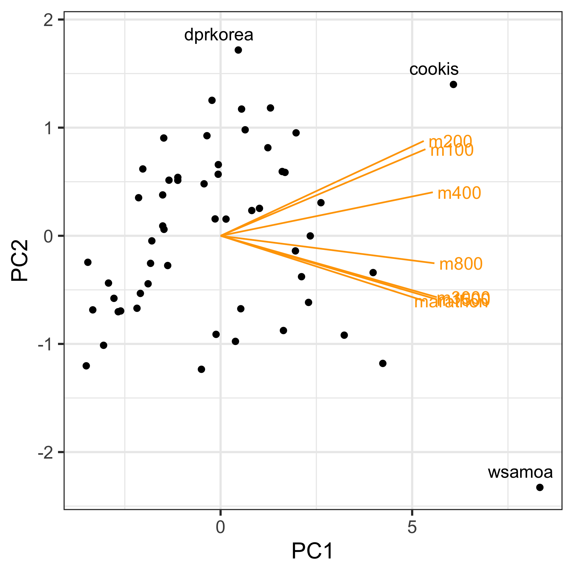
Assess: Data-in-the-model-space
Visualise model using a biplot: Plot the principal component scores, and also the contribution of the original variables to the principal component.
A biplot is like a single projection from a tour.
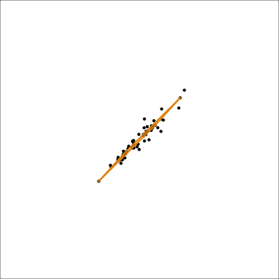
Assess: Model-in-the-data-space
track_std <- track |>
  mutate_if(is.numeric, function(x) (x-
      mean(x, na.rm=TRUE))/
      sd(x, na.rm=TRUE))
track_std_pca <- prcomp(track_std[,1:7],
               scale = FALSE,
               retx=TRUE)
track_model <- pca_model(track_std_pca, d=2, s=2)
track_all <- rbind(track_model$points, track_std[,1:7])
animate_xy(track_all, edges=track_model$edges,
           edges.col="#E7950F",
           edges.width=3,
           axes="off")
render_gif(track_all,
           grand_tour(),
           display_xy(
                      edges=track_model$edges,
                      edges.col="#E7950F",
                      edges.width=3,
                      axes="off"),
           gif_file="gifs/track_model.gif",
           frames=500,
           width=400,
           height=400,
           loop=FALSE)
Mostly captures the variance in the data. Seems to slightly miss the non-linear relationship.
UMAP (1/2)
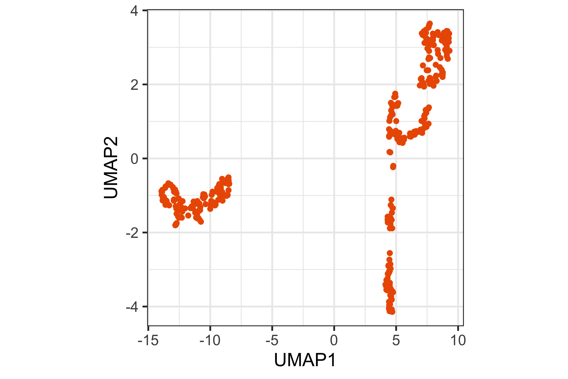
UMAP (2/2)
UMAP 2D representation
Tour animation