ETC3250/5250 Tutorial 11

Model-based clustering and self-organising maps

Author

Prof. Di Cook

Published

13 May 2024

Load the libraries and avoid conflicts, and prepare data
# Load libraries used everywhere
library(tidyverse)
library(tidymodels)
library(tidyclust)
library(purrr)
library(ggdendro)
library(fpc)
library(mclust)
library(kohonen)
library(patchwork)
library(mulgar)
library(tourr)
library(geozoo)
library(ggbeeswarm)
library(colorspace)
library(detourr)
library(crosstalk)
library(plotly)
library(ggthemes)
library(conflicted)
conflicts_prefer(dplyr::filter)
conflicts_prefer(dplyr::select)
conflicts_prefer(dplyr::slice)
conflicts_prefer(purrr::map)

🎯 Objectives

The goal for this week is practice fitting model-based clustering and self-organising maps.

🔧 Preparation

  • Make sure you have all the necessary libraries installed.

Exercises:

1. Clustering spotify data with model-based

This exercise is motivated by this blog post on using \(k\)-means to identify anomalies.

You can read and pre-process the data with this code. Variables mode, time_signature and instrumentalness are removed because they have just a few values. We have also transformed some variables to remove skewness, and standardised the data.

# https://towardsdatascience.com/unsupervised-anomaly-detection-on-spotify-data-k-means-vs-local-outlier-factor-f96ae783d7a7
spotify <- read_csv("https://raw.githubusercontent.com/isaacarroyov/spotify_anomalies_kmeans-lof/main/data/songs_atributtes_my_top_100_2016-2021.csv") |>
  select(-c(mode, time_signature, instrumentalness)) # variables with few values

spotify_tf <- spotify |>
  mutate(speechiness = log10(speechiness),
         liveness = log10(liveness),
         duration_ms = log10(duration_ms),
         danceability = danceability^2,
         artist_popularity = artist_popularity^2,
         acousticness = log10(acousticness)) |>
  mutate_if(is.numeric, function(x) (x-mean(x))/sd(x)) 
  1. Fit model-based clustering with number of clusters ranging from 1-15, to the transformed data, and all possible parametrisations. Summarise the best models, and plot the BIC values for the models. You can also simplify the plot, and show just the 10 best models.
s_mc <- mclustBIC(spotify_tf[,5:15], G=1:15)
summary(s_mc)
Best BIC values:
          VVE,4    VVE,5  VVE,6
BIC      -14772 -14773.5 -14775
BIC diff      0     -1.8     -3
smc1 <- ggmcbic(s_mc) 
ggplotly(smc1)
smc2 <- ggmcbic(s_mc, top=10) 
ggplotly(smc2)

The best parametrisation is the VVE model, and four clusters yields the best BIC.

  1. Why are some variance-covariance parametrisations fitted to less than 15 clusters?

The number of parameters needed is too many for the number of observations.

  1. Make a 2D sketch that would illustrate what the best variance-covariance parametrisation looks like conceptually for cluster shapes.

  2. How many parameters need to be estimated for the VVE model with 7 and 8 clusters? Compare this to the number of observations, and explain why the model is not estimated for 8 clusters.

VVE means the volume and shape are variable, and a common orientation between clusters. It can be written as \(\lambda_k D A_k D^\top\).

\(n=507, p=11, G=7\text{ or }8\)

  • \(\widehat{\mu}_k\) (7 11-D means): \(7\times 11= 77\)
  • \(\widehat{A}_k\) (7 \(11\times 11\)-D diagonal matrices): \(7\times 11= 77\)
  • \(D\) (one \(11\times 11\)-D matrix, upper and lower triangles the same): \(\sum_{i=1}^7 i = 28\)
  • \(\lambda_k\) (7 size parameters): 7
  • \(\pi\) (mixing proportions): \(7-1 = 6\)

For 7 clusters 195 parameters are estimated.

  • \(\widehat{\mu}_k\) (8 11-D means): \(8\times 11= 88\)
  • \(\widehat{A}_k\) (8 \(11\times 11\)-D diagonal matrices): \(8\times 11= 88\)
  • \(D\) (one \(11\times 11\)-D matrix, upper and lower triangles the same): \(\sum_{i=1}^8 i = 36\)
  • \(\lambda_k\) (8 size parameters): 8
  • \(\pi\) (mixing proportions): \(8-1 = 7\)

For 8 clusters 227 parameters are used.

Both of these are less than the number of observations (507), so it should be possible to fit both. For 8 clusters, though it is about 2 observations per parameter. It’s not much better for 7 clusters, but the model is fitted anyway. It’s not clear why but its interesting.

  1. Fit just the best model, and extract the parameter estimates. Write a few sentences describing what can be learned about the way the clusters subset the data.
spotify_mc <- Mclust(spotify_tf[,5:15], 
                      G=4, 
                      modelNames = "VVI")
spotify_mc$parameters$mean
                    [,1]   [,2]    [,3]   [,4]
danceability      -0.318 -0.487  0.7005 -0.353
energy            -0.753 -1.060  0.2262  0.864
key                0.055 -0.092  0.0896 -0.090
loudness          -0.981 -0.697  0.3228  0.674
speechiness        0.882 -0.737  0.0287 -0.166
acousticness       0.552  0.786 -0.0099 -0.831
liveness           0.012 -0.342 -0.0882  0.309
valence           -0.073 -0.892  0.3801  0.125
tempo              0.291  0.012 -0.3152  0.188
duration_ms       -0.087  0.312 -0.1718  0.078
artist_popularity -0.399  0.101  0.2059 -0.052
# spotify_mc$parameters$variance$sigma
spotify_var <- bind_rows(
  diag(spotify_mc$parameters$variance$sigma[,,1]),
  diag(spotify_mc$parameters$variance$sigma[,,2]),
  diag(spotify_mc$parameters$variance$sigma[,,3]),
  diag(spotify_mc$parameters$variance$sigma[,,4]))
spotify_var[,1:6]
# A tibble: 4 × 6
  danceability energy   key loudness speechiness acousticness
         <dbl>  <dbl> <dbl>    <dbl>       <dbl>        <dbl>
1        1.27   1.01  0.813    1.90        1.37         0.415
2        0.843  0.614 0.880    0.539       0.155        0.254
3        0.564  0.321 1.09     0.186       0.735        0.520
4        0.508  0.188 1.06     0.169       0.722        1.15 
spotify_var[,7:11]
# A tibble: 4 × 5
  liveness valence tempo duration_ms artist_popularity
     <dbl>   <dbl> <dbl>       <dbl>             <dbl>
1    1.06    1.14  1.77        3.56              1.33 
2    0.228   0.546 1.14        0.491             1.16 
3    1.04    0.755 0.366       0.355             0.724
4    1.19    0.796 0.967       0.302             0.853

Because the the data is standardised differences between means and variances from one cluster to another can be compared directly.

We could say that cluster 1 has high speechiness, and low energy, loudness. In contrast, cluster 4 has high energy and loudness, but low acousticness.

On the variances, cluster 1 has low variance for acousticness, which means all songs in this cluster have similar acousticness. Cluster 4 has small variance on energy and loudness, so these songs have similar values on these variables.

2. Clustering simulated data with known cluster structure

  1. In tutorial of week 10 you clustered c1 from the mulgar package, after also examining this data using the tour in week 3. We know that there are 6 clusters, but with different sizess. For a model-based clustering, what would you expect is the best variance-covariance parametrisation, based on what you know about the data thus far?

We would expect 6 clusters would give the best results. The two big clusters are elliptical but oriented along variable axes, and have no variance in some variables. The four small clusters are spherical in the full 6D.

  1. Fit a range of models for a choice of clusters that you believe will cover the range needed to select the best model for this data. Make your plot of the BIC values, and summarise what you learn. Be sure to explain whether this matches what you expected or not.
c1_mc <- mclustBIC(c1, G=3:8)
summary(c1_mc)
Best BIC values:
         VVI,6 VVI,7 VVE,6
BIC       2814  2757  2735
BIC diff     0   -56   -78
c1mc1 <- ggmcbic(c1_mc) +
  scale_x_continuous(breaks=1:6, labels=3:8)
ggplotly(c1mc1)
c1mc2 <- ggmcbic(c1_mc, top=10) +
  scale_x_continuous(breaks=1:6, labels=3:8)
ggplotly(c1mc2)

Interestingly the 6 cluster model is the best, and it uses a VVI parametrisation.

  1. Fit the best model, and examine the model in the data space using a tour. How well does it fit? Does it capture the clusters that we know about?
c1_mc <- Mclust(c1, G=6, 
                modelNames = "VVI")
c1_mce <- mc_ellipse(c1_mc)
c1_cl <- c1
c1_cl$cl <- factor(c1_mc$classification)

c1_mc_data <- c1_cl |>
  mutate(type = "data") |>
  bind_rows(bind_cols(c1_mce$ell,
                      type=rep("ellipse",
                        nrow(c1_mce$ell)))) |>
  mutate(type = factor(type))
animate_xy(c1_mc_data[,1:6],
           col=c1_mc_data$cl,
           pch=c(4, 20 )[as.numeric(c1_mc_data$type)], 
           axes="off")

Wow! It fits the clusters beautifully!

3. Music similarity

  1. The music data was collected by extracting the first 40 seconds of each track from CDs using the music editing software Amadeus II, saved as a WAV file and analysed using the R package tuneR. Only a subset of the data is provided, with details:
  • title: Title of the track
  • artist: Abba, Beatles, Eels, Vivaldi, Mozart, Beethoven, Enya
  • type: rock, classical, or new wave
  • lvar, lave, lmax: average, variance, maximum of the frequencies of the left channel
  • lfener: an indicator of the amplitude or loudness of the sound
  • lfreq: median of the location of the 15 highest peak in the periodogram

You can read the data into R using:

music <- read_csv("http://ggobi.org/book/data/music-sub.csv") |>
  rename(title = `...1`)

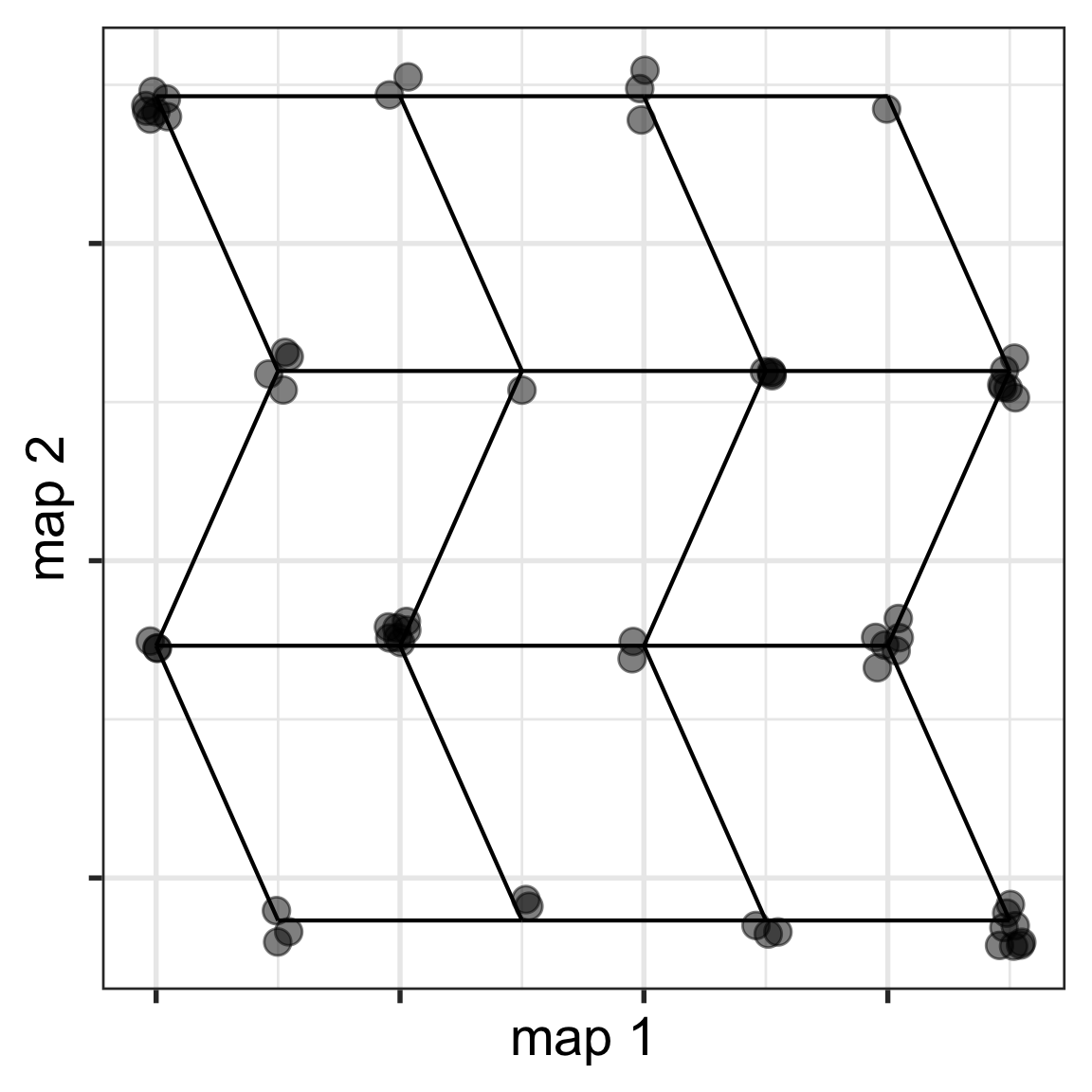
How many observations in the data? Explain how this should determine the maximum grid size for an SOM.

There are only 62 observations. If you use a 5x5 grid, this is less than 3 observations per cluster. You need to be careful about specifying a model with too many nodes for the number of observations. At the same time and SOM needs to have some flexibility to fit the data shape, and more nodes allows more flexibility.

  1. Fit a SOM model to the data using a 4x4 grid, using a large rlen value. Be sure to standardise your data prior to fitting the model. Make a map of the results, and show the map in both 2D and 5D (using a tour).
set.seed(831)
music_std <- music |>
  mutate_if(is.numeric, 
            function(x) (x-mean(x))/sd(x))
music_som1 <- som(as.matrix(music_std[,4:8]), 
                 grid = somgrid(4, 4, "hexagonal"), rlen=2000)
music_som1_df_net <- som_model(music_som1)
music_som1_data <- music_som1_df_net$data |> 
  mutate(cl = music_som1$unit.classif,
         title = music_std$title,
         artist = music_std$artist) |>
  select(id, title, artist, lvar:distance)

ggplot() +
  geom_segment(data=music_som1_df_net$edges_s, 
               aes(x=x, xend=xend, y=y, 
                   yend=yend)) +
  geom_point(data=music_som1_data, 
             aes(x=map1, y=map2, label=paste(artist, title)), 
             size=3, alpha=0.5) +
  xlab("map 1") + ylab("map 2") +
  theme(legend.position = "bottom",
        legend.title = element_blank(),
        axis.text = element_blank())

# ggplotly()

# 5D
music_som1_map <- music_som1_df_net$net |>
  mutate(artist = "0", 
         title = "0",
         type="net")
music_som1_data_tour <- music_som1_data |> 
  select(lvar:lfreq, artist, title) |>
  mutate(type="data") 
music_som1_map_data <- bind_rows(
  music_som1_map, music_som1_data_tour)
music_som1_map_data$type <- factor(music_som1_map_data$type,
  levels=c("net", "data"))
animate_xy(music_som1_map_data[,1:5],
           pch=music_som1_map_data$type,
           shapeset=c(46, 16),
           edges=as.matrix(music_som1_df_net$edges), 
           edges.col = "black",
           axes="bottomleft")
  1. Let’s take a look at how it has divided the data into clusters. Set up linked brushing between detourr and map view using the code below.
music_som1_shared <- SharedData$new(music_som1_data)

music_detour <- detour(music_som1_shared, tour_aes(
  projection = lvar:lfreq)) |>
  tour_path(grand_tour(2),
            max_bases=50, fps = 60) |>
  show_scatter(alpha = 0.9, axes = FALSE,
               width = "100%", height = "450px")

music_map <- plot_ly(music_som1_shared,
     x = ~map1,
     y = ~map2,
     text = ~paste(title, artist),
     marker = list(color="black", size=8),
     height = 450) |>
  highlight(on = "plotly_selected",
            off = "plotly_doubleclick") |>
  add_trace(type = "scatter",
            mode = "markers")

bscols(
  music_detour, music_map,
  widths = c(5, 6)
)

Can you see a small cluster of Abba songs? Which two songs are outliers? Which Beethoven piece is most like a Beatles song?

👋 Finishing up

Make sure you say thanks and good-bye to your tutor. This is a time to also report what you enjoyed and what you found difficult.