Load the libraries and avoid conflicts, and prepare data
# Load libraries used everywherelibrary(tidyverse)library(tidymodels)library(tidyclust)library(purrr)library(ggdendro)library(fpc)library(patchwork)library(mulgar)library(tourr)library(geozoo)library(ggbeeswarm)library(colorspace)library(plotly)library(ggthemes)library(conflicted)conflicts_prefer(dplyr::filter)conflicts_prefer(dplyr::select)conflicts_prefer(dplyr::slice)conflicts_prefer(purrr::map)
🎯 Objectives
The goal for this week is learn to about clustering data using \(k\)-means and hierarchical algorithms.
🔧 Preparation
Make sure you have all the necessary libraries installed.
Exercises:
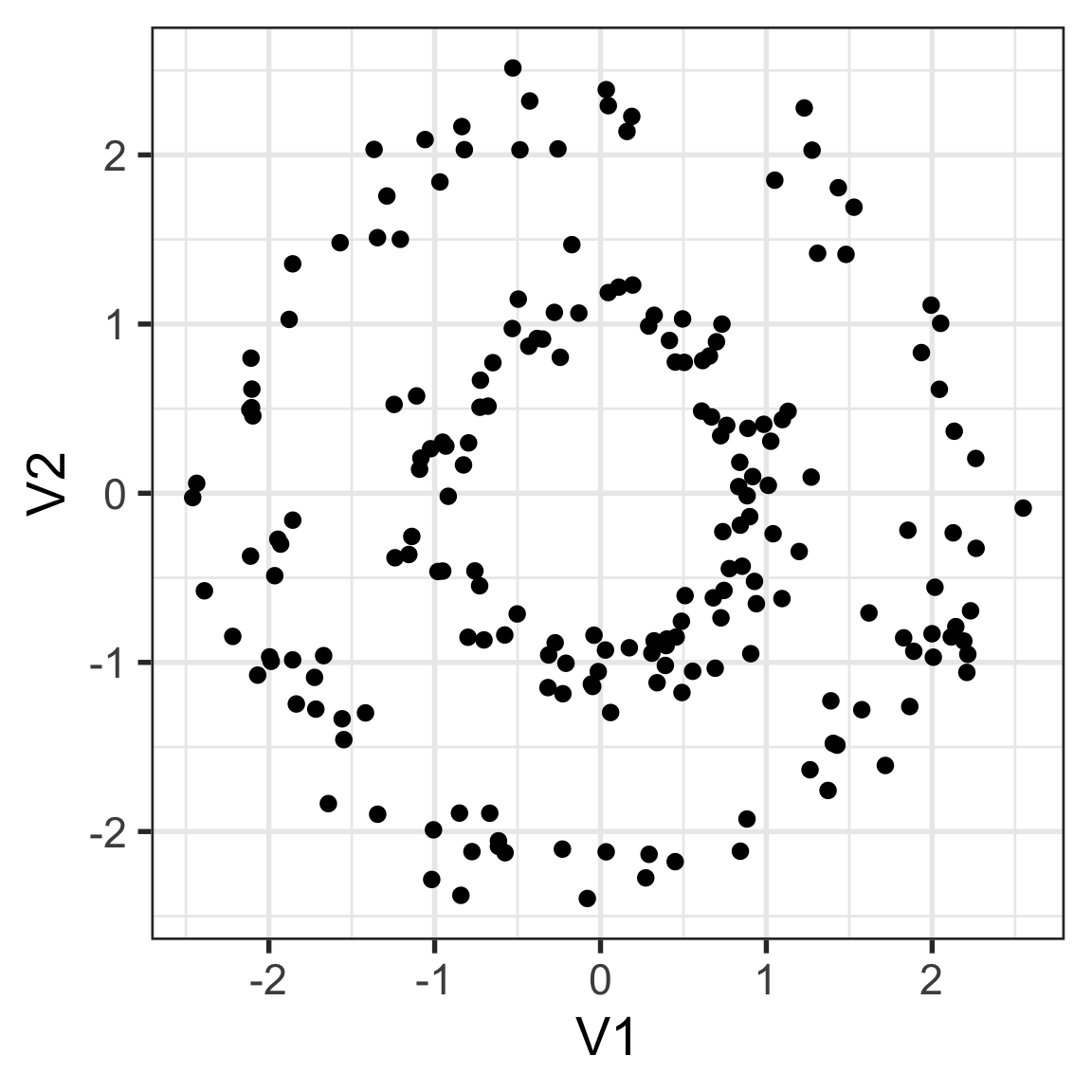
1. How would you cluster this data?
How would you cluster this data?
Derive a distance metric that will capture your clusters. Provide some evidence that it satisfies the four distance rules.
Compute your rule on the data, and establish that it does indeed capture your clusters.
Solution
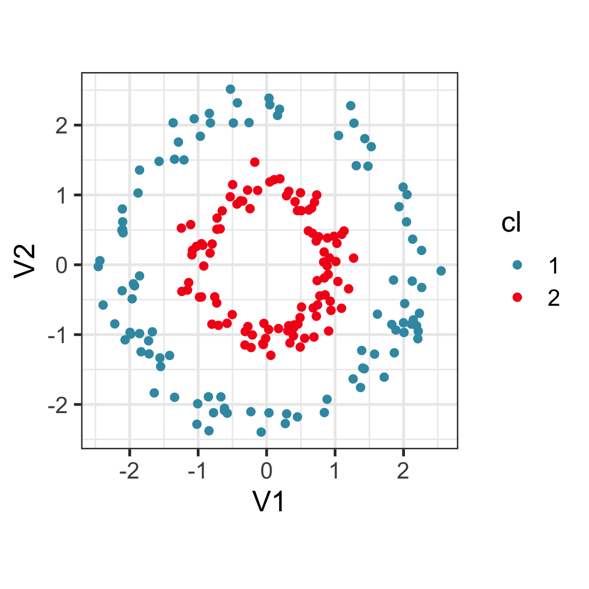
My distance will use the radial distance from \((0, 0)\). You first convert each point into polar coordinates, but only take the radius. This will always be positive. The distance between two points will be the absolute value of the difference between these values.
mydist <-function(x1, x2) { d <-abs(sqrt(sum(x1^2)) -sqrt(sum(x2^2)))return(d)}ch_dist <-matrix(0, nrow(challenge), nrow(challenge)) for (i in1:(nrow(challenge)-1)) {for (j in (i+1):nrow(challenge)) { ch_dist[i,j] <-mydist(challenge[i,], challenge[j,]) ch_dist[j,i] <- ch_dist[i,j] }}#x <- as.vector(ch_dist)#hist(x, 30) # you can see it is bimodalch_dist <-as.dist(ch_dist)ch_hc <-hclust(ch_dist, method="ward.D2")ch_cl <- challenge |>mutate(cl =factor(cutree(ch_hc, 2)))ggplot(ch_cl, aes(x=V1, y=V2, colour=cl)) +geom_point() +scale_color_discrete_divergingx(palette="Zissou 1")
2. Clustering spotify data with k-means
This exercise is motivated by this blog post on using \(k\)-means to identify anomalies.
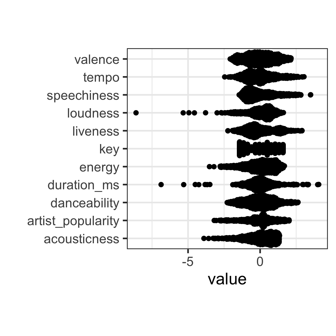
You can read the data with this code. And because for clustering you need to first standardise the data the code will also do this. Variables mode and time_signature are removed because they have just a few values.
# https://towardsdatascience.com/unsupervised-anomaly-detection-on-spotify-data-k-means-vs-local-outlier-factor-f96ae783d7a7spotify <-read_csv("https://raw.githubusercontent.com/isaacarroyov/spotify_anomalies_kmeans-lof/main/data/songs_atributtes_my_top_100_2016-2021.csv")spotify_std <- spotify |>mutate_if(is.numeric, function(x) (x-mean(x))/sd(x)) |>select(-c(mode, time_signature)) # variables with few values
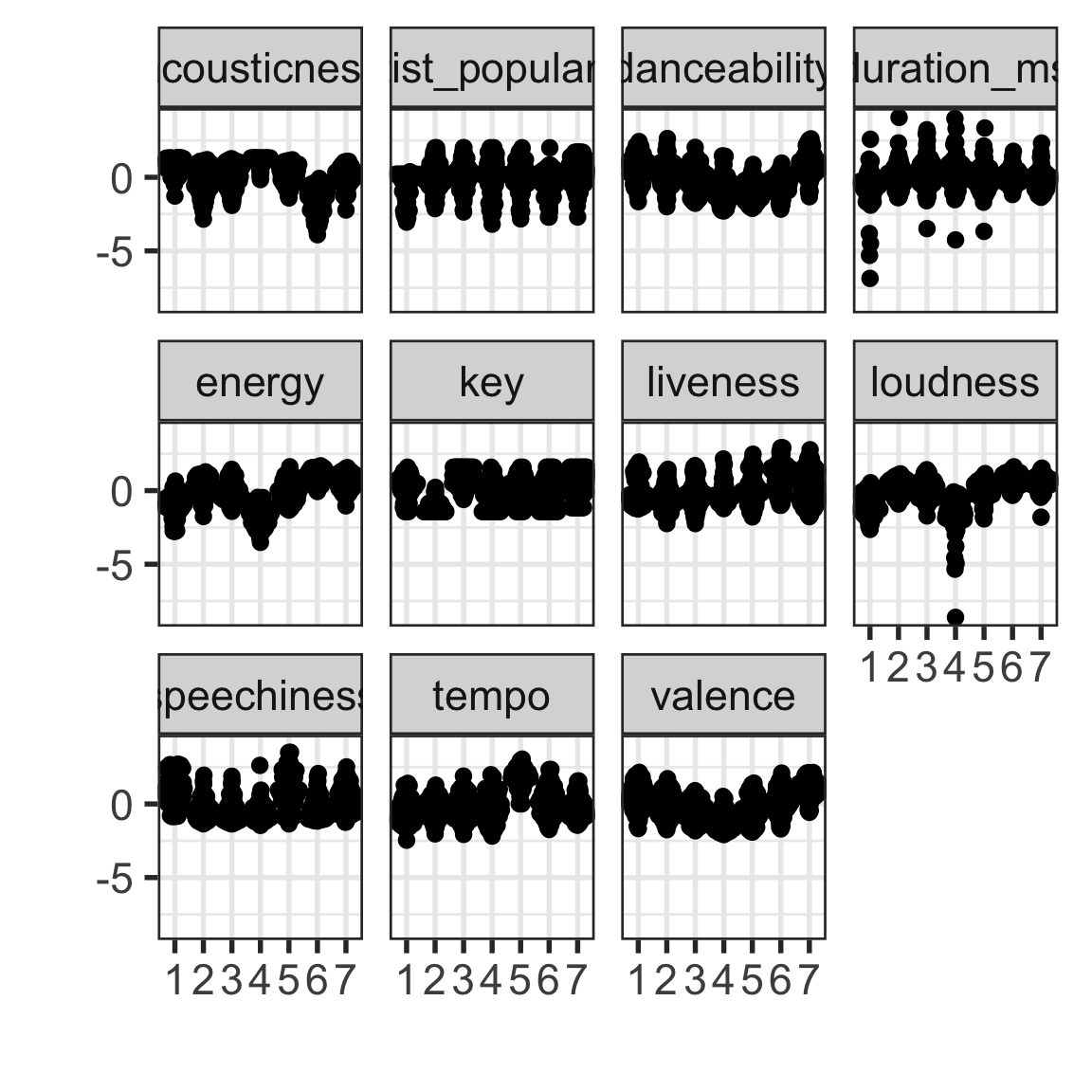
Make a plot of all of the variables. This could be a density or a jittered dotplot (beeswarm::quasirandom). Many of the variables have skewed distributions. For cluster analysis, why might this be a problem? From the blog post, are any of the anomalies reported ones that can be seen as outliers in a single skewed variable?
The skewed variables are speechiness, liveliness, instrumentalness, artist_popularity, accousticness and possible we could mark duration_ms as having some skewness but also some low anomalies.
Yes, for example “Free Bird” and “Sparkle” could be found by simply examining a single variable.
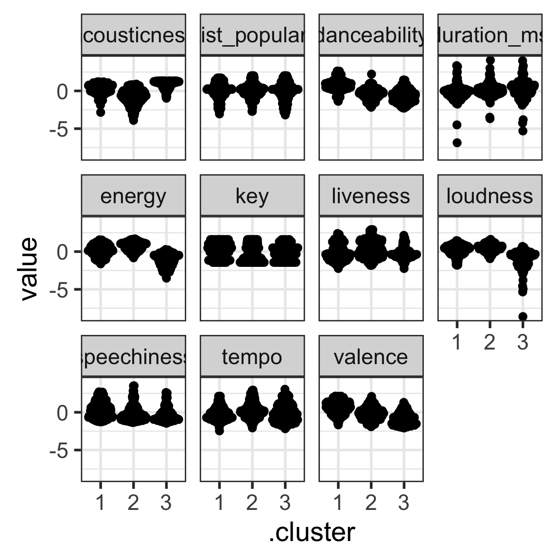
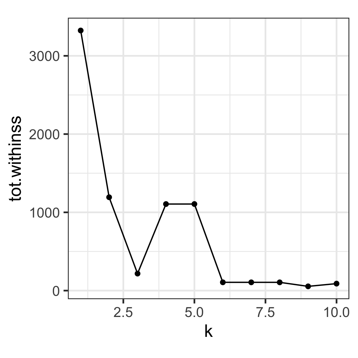
Transform the skewed variables to be as symmetric as possible, and then fit a \(k=3\)-means clustering. Extract and report these metrics: totss, tot.withinss, betweenss. What is the ratio of within to between SS?
The differences between clusters is mostly in acousticness, danceability, energy, loudness, valence.
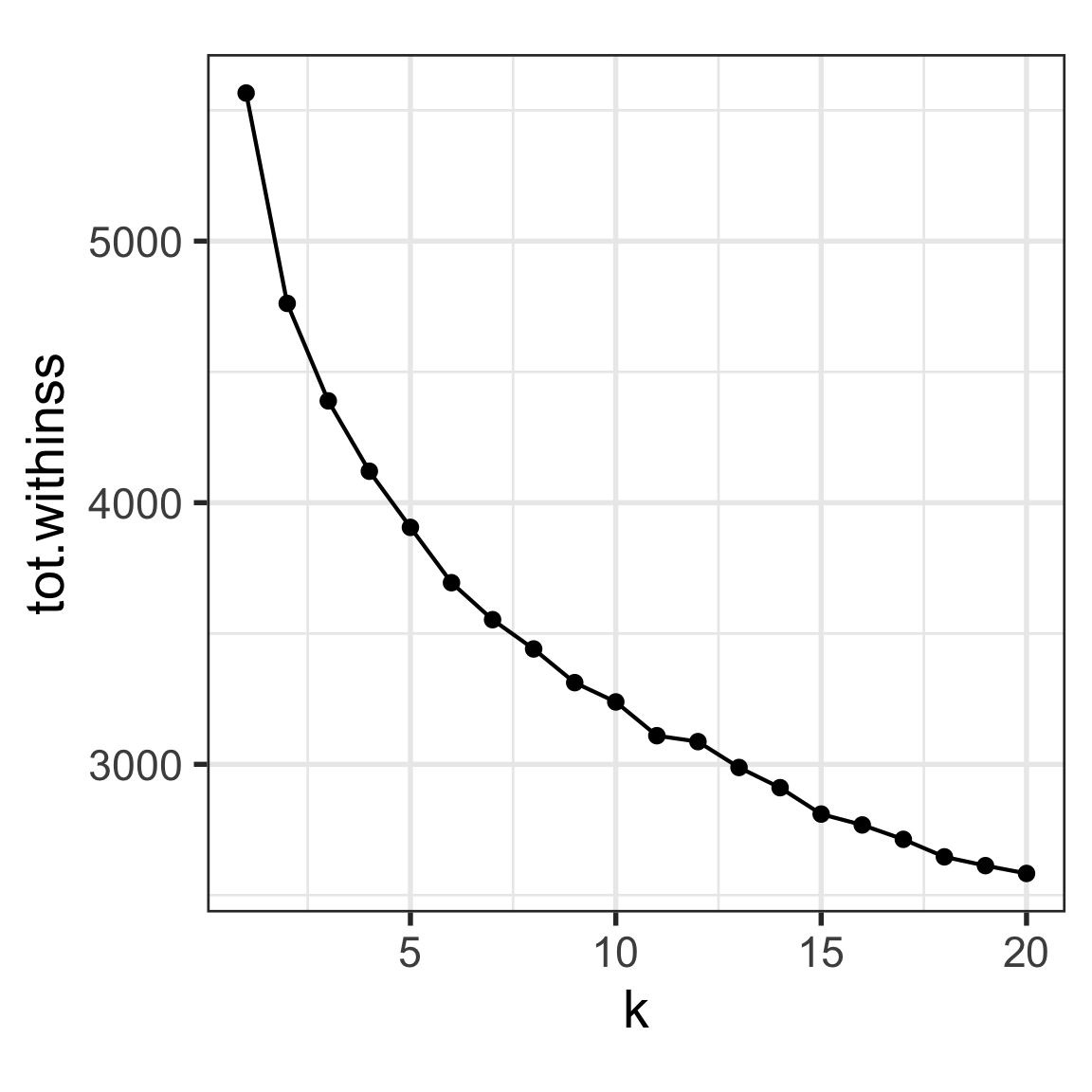
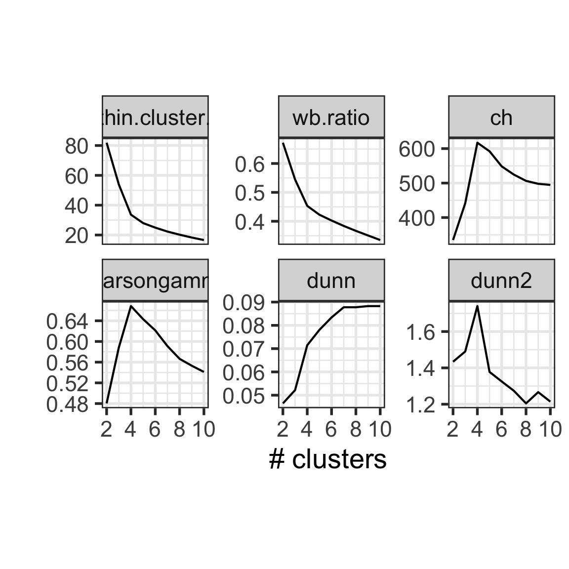
Now the algorithm \(k=1, ..., 20\). Extract the metrics, and plot the ratio of within SS to between SS against \(k\). What would be suggested as the best model?
Maybe 11, but the within SS decays very gradually so it is hard to tell.
Divide the data into 11 clusters, and examine the number of songs in each. Using plotly, mouse over the resulting plot and explore songs belonging to a cluster. (I don’t know much about these songs, but if you are a music fan maybe discussing with other class members and your tutor about the groupings, like which ones are grouped in clusters with high liveness, high tempo or danceability could be fun.)
Solution
# Extract data with different classes labelledspotify_assign <- spotify_km %>%unnest(cols =c(augmented))spotify_assign_df <- spotify_assign |>select(name:`artist_popularity`, k, .cluster) |>pivot_wider(names_from=k, values_from=.cluster)spotify_assign_df |>select(name:`artist_popularity`, `7`) |>pivot_longer(danceability:artist_popularity,names_to="var", values_to="value") |>ggplot(aes(x=`7`, y=value, label=name)) +geom_quasirandom() +facet_wrap(~var, ncol=4) +xlab("") +ylab("")
# ggplotly()
3. Clustering several simulated data sets with known cluster structure
In tutorial of week 3 you used the tour to visualise the data sets c1 and c3 provided with the mulgar package. Review what you said about the structure in these data sets, and write down your expectations for how a cluster analysis would divide the data.
Solution
animate_xy(c1)animate_xy(c3)
We said:
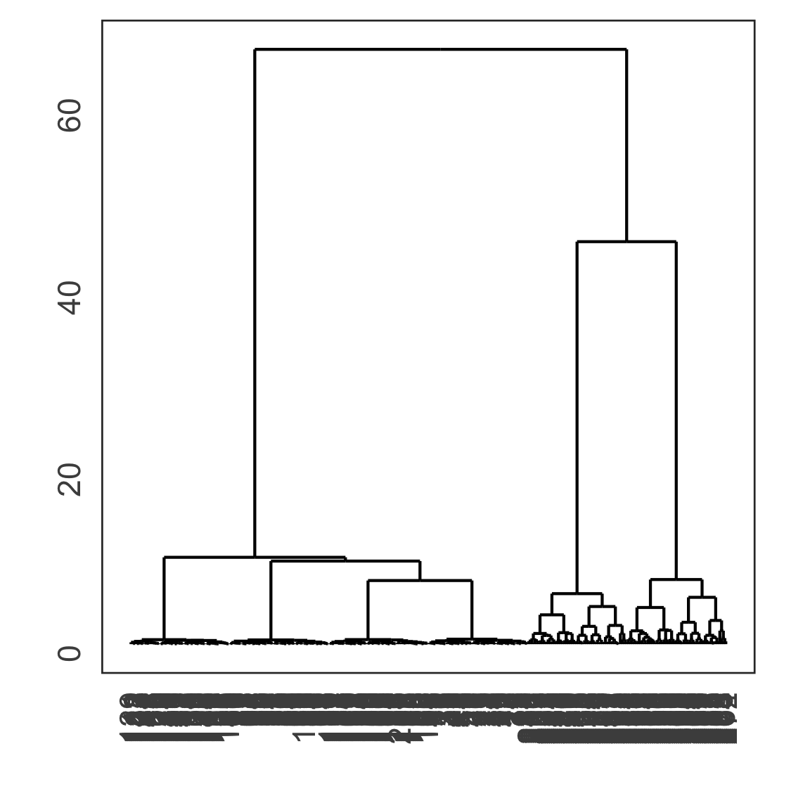
c1 has 6 clusters, 4 small ones, and two big ones. The two big ones look like planes because they have no variation in some dimensions. We would expect that a clustering analysis divides the data into these 6 clusters.
c3 has a triangular prism shape, which itself is divided into several smaller triangular prisms. It also has several dimensions with no variation, because the points collapse into a line in some projections. We would expect the clustering analysis to divide the data into four clusters corresponding mostly to the four vertices.
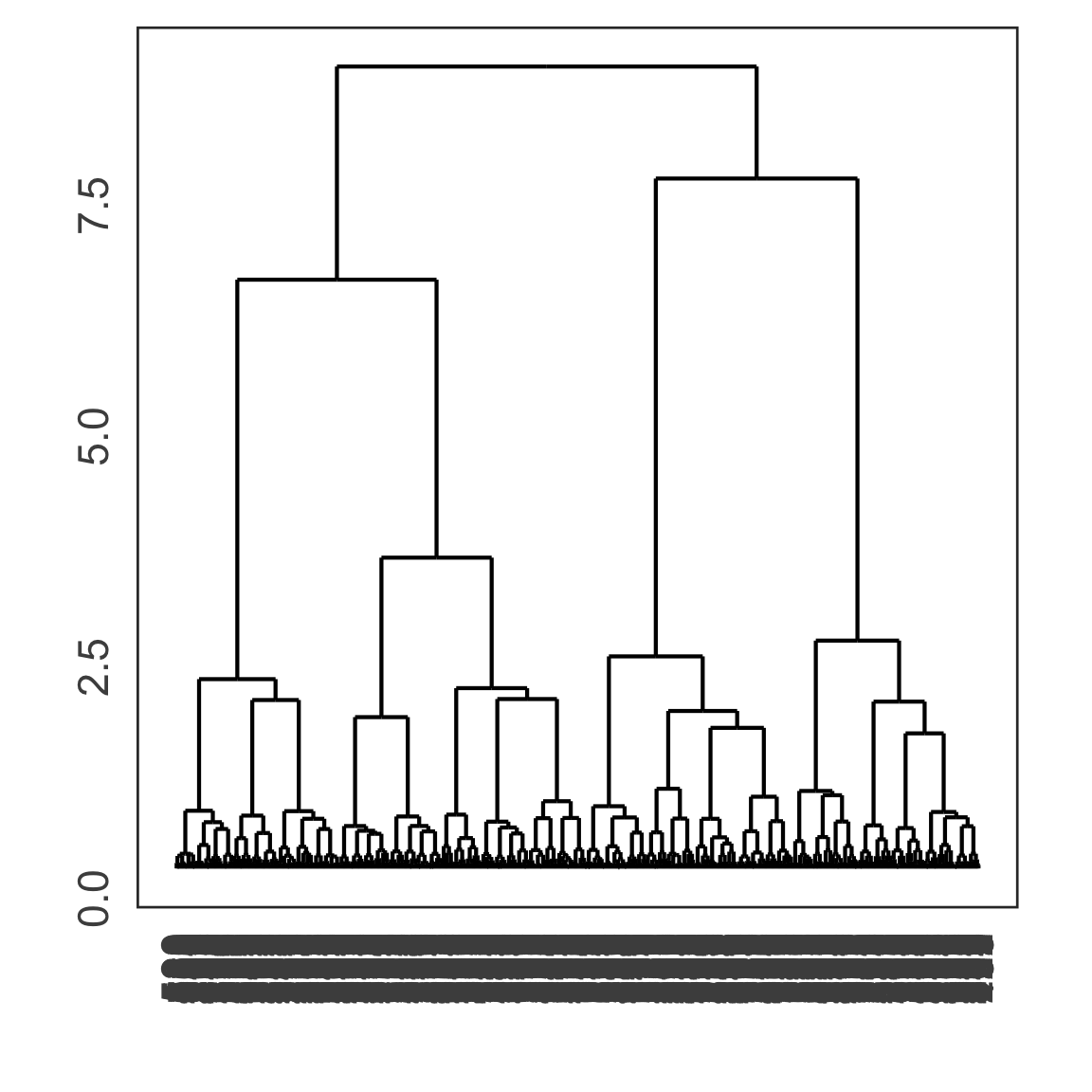
Compute \(k\)-means and hierarchical clustering on these two data sets, without standardising them. Use a variety of \(k\), linkage methods and check the resulting clusters using the cluster metrics. What method produces the best result, relative to what you said in a. (NOTE: Although we said that we should always standardise variables before doing clustering, you should not do this for c3. Why?)
Solution
The scale of the variables is meaningful for these data sets. Even though some variables have smaller variance than others we would treat them to be measured on the same scale.
# Extract data with different classes labelledc1_assign <- c1_km %>%unnest(cols =c(augmented))c1_assign_df <- c1_assign |>select(x1:x6, k, .cluster) |>pivot_wider(names_from=k, values_from=.cluster)
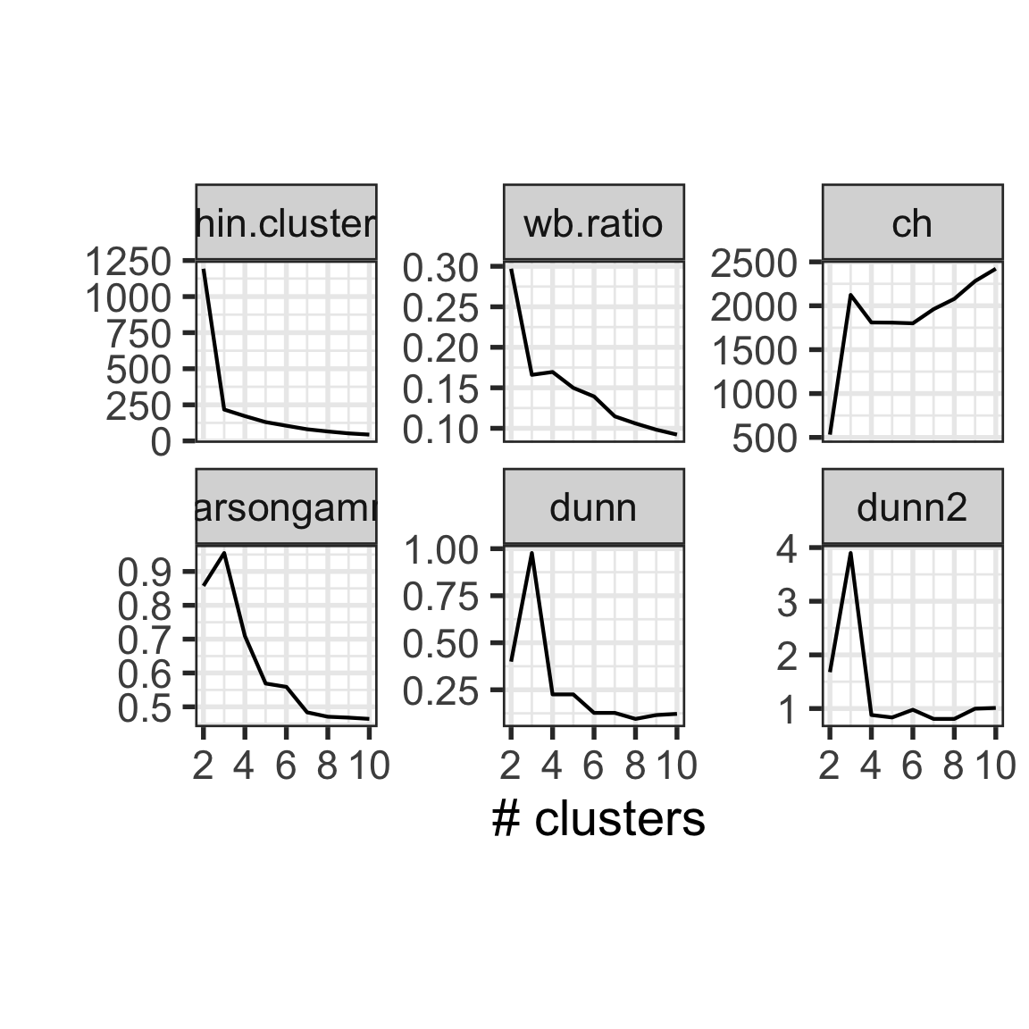
The statistics suggest that 3 clusters is the best solution. If we look at the 6 clusters solution, it is different from what we would expect, one large cluster is divided, as is a small cluster.
The four cluster solution is almost what we would expect, that they divide the data on the four vertices of the tetrahedron. One of the vertices is a little confused with one other.
If you run \(k\)-means, I’d expect it does similarly to this solution. If you choose a different linkage method likely the results will change a lot.
There are five other data sets in the mulgar package. Choose one or two or more to examine how they would be clustered. (I particularly would like to see how c4 is clustered.)
👋 Finishing up
Make sure you say thanks and good-bye to your tutor. This is a time to also report what you enjoyed and what you found difficult.